

engineering.
google
.
Role
Brand Identity Design
Agency
Google Developer Marketing
Brand Identity Design
Agency
Google Developer Marketing
.
The challenge:
Connecting with a community of skeptics
Connecting with a community of skeptics
The core challenge was to build a brand for experienced software developers – an audience that is deeply skeptical of traditional marketing and tired of the industry’s visual clichés of glowing circuits and abstract code.
The brand had to feel authentic, useful, and educational at every touchpoint, avoiding any hint that it was “selling” something.
The central creative question was: How can we visually express the act of collaborative learning –the sharing of “rough ideas and organic thinking”– in a way that feels human, authentic, and credible?
The brand needed to stand apart from the sterile, robotic perception of engineering and reflect its true nature as a deeply human and creative craft.
The Strategy:
Defining an ownable position
Defining an ownable position
Before designing, we established a clear strategic position. A review of the competitive landscape revealed a reliance on inconsistent styles or unownable stock imagery. Our opportunity was to be more authentic and human.
The strategy was built on two pillars that define a unique space for engineering.google:
1. Universal Principles:
Focusing on timeless, fundamental engineering concepts that apply to any project, rather than solutions for a specific technology.
Focusing on timeless, fundamental engineering concepts that apply to any project, rather than solutions for a specific technology.
2. Proven at Scale:
This is the brand’s ultimate differentiator. The knowledge shared is not just theory; it has been battle-tested and validated within one of the world’s most demanding engineering environments, which provides the ultimate form of credibility.
This is the brand’s ultimate differentiator. The knowledge shared is not just theory; it has been battle-tested and validated within one of the world’s most demanding engineering environments, which provides the ultimate form of credibility.
This strategy positions engineering.google as the only place to learn the fundamental rules of engineering, proven with a depth that no one else can claim.
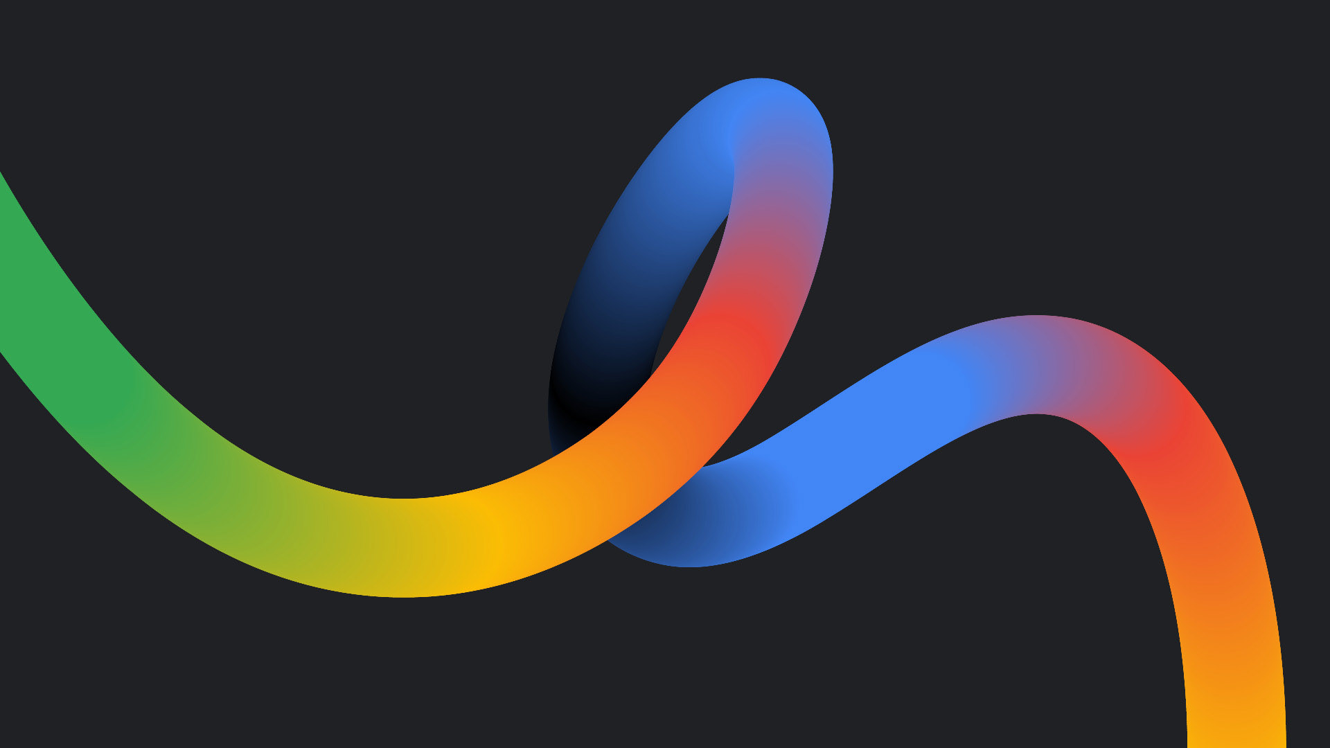
The Creative Idea:
Untangling the Knot
Untangling the Knot
The strategy led to a powerful, singular creative concept: “Untangling the Knot.” This central metaphor became the foundation for the entire visual identity.
The concept is effective because it:
Connects to the engineering mindset:
It directly references the core engineering challenge of solving complex, “knotty” problems.
It directly references the core engineering challenge of solving complex, “knotty” problems.
Tells a story:
It creates a narrative of transformation, a “path to clarity” that visualizes the journey from a difficult tangle to an elegant solution.
Feels human and authentic:
It has a bold, active aesthetic that feels like a signature, framing problem-solving as an energetic, creative act rather than a sterile, robotic one.
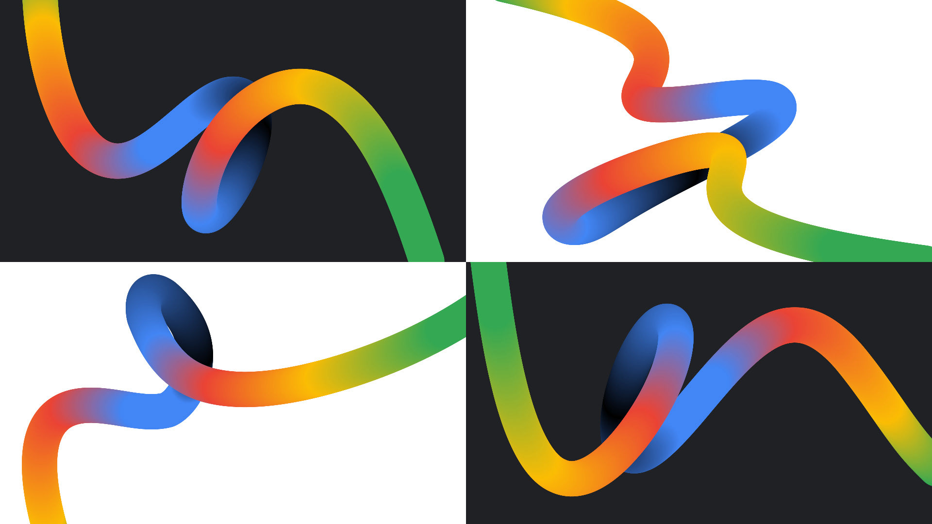
Building the visual identity
The “Untangling the Knot” concept was translated into a comprehensive and flexible brand toolkit.
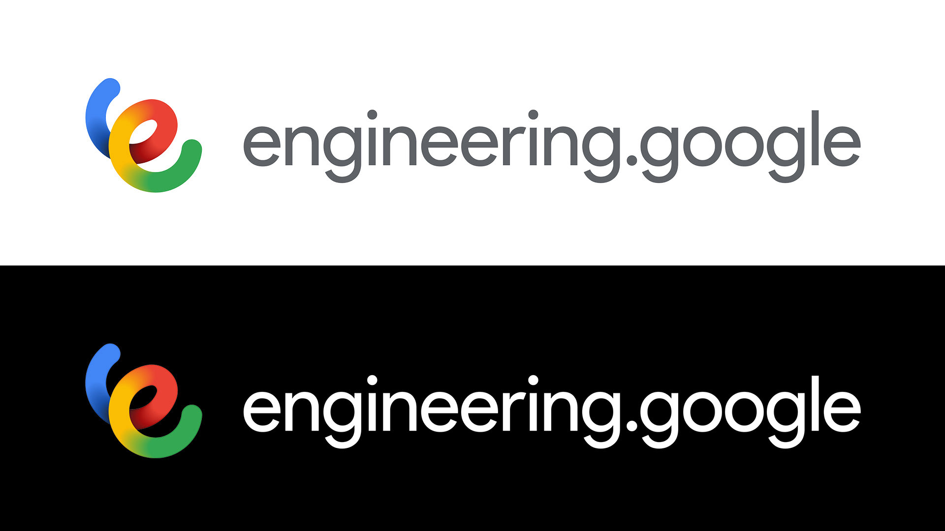
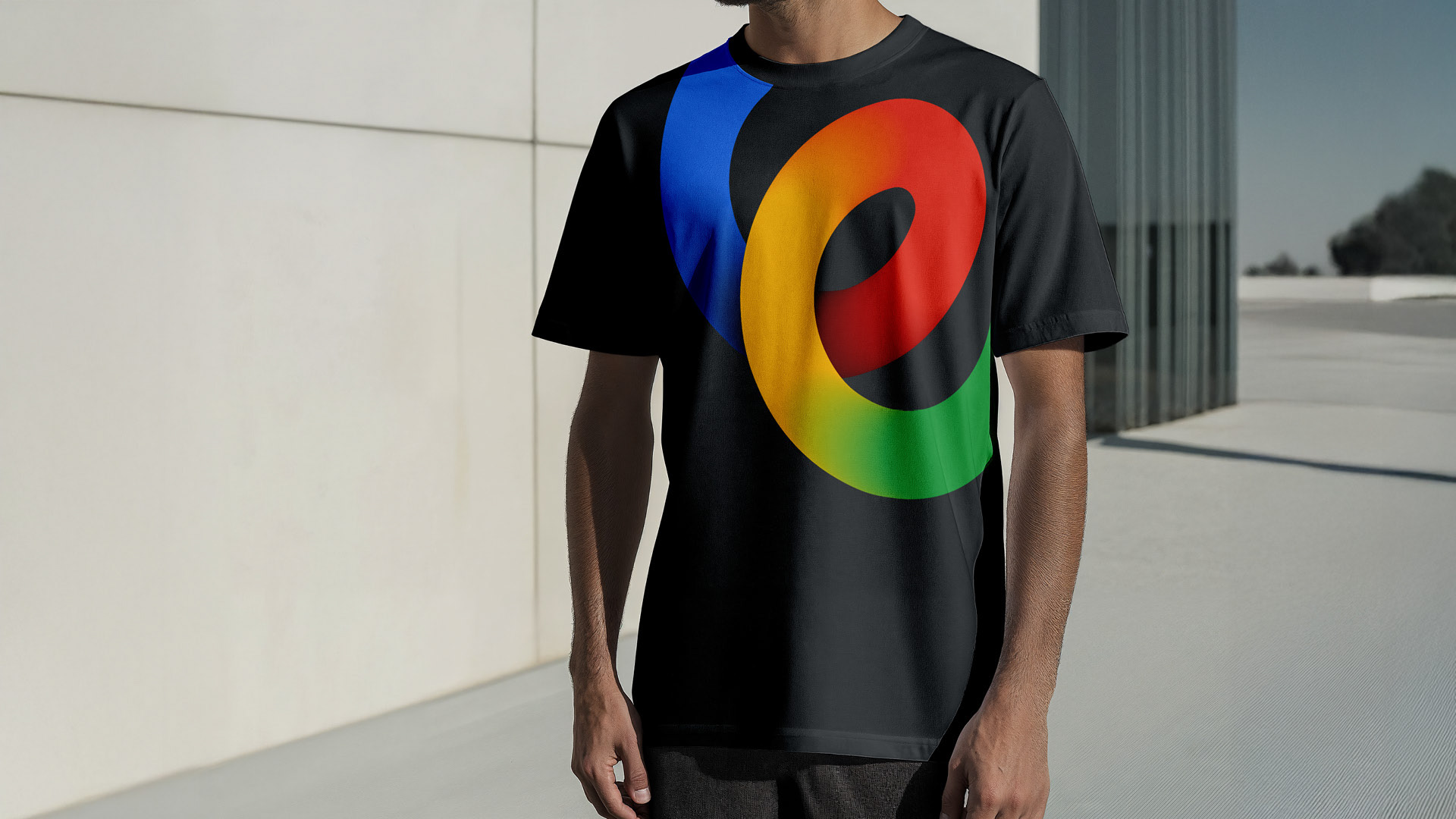
Logo
The symbol is a fluid, continuous line forming a lowercase “e”. It is a direct distillation of the untangling ribbon, acting as a friendly and dynamic signature that embodies the creative act of problem-solving.
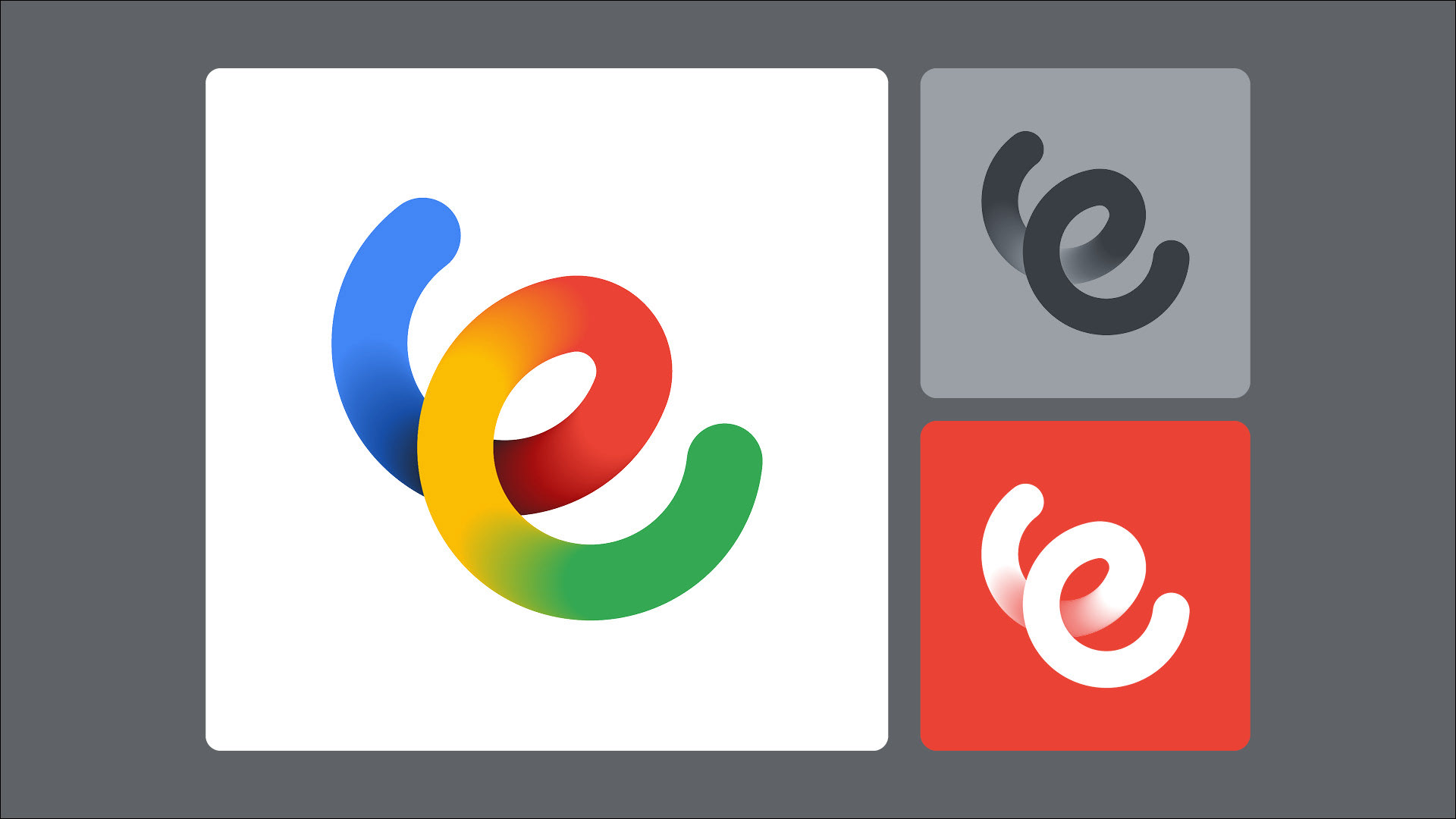
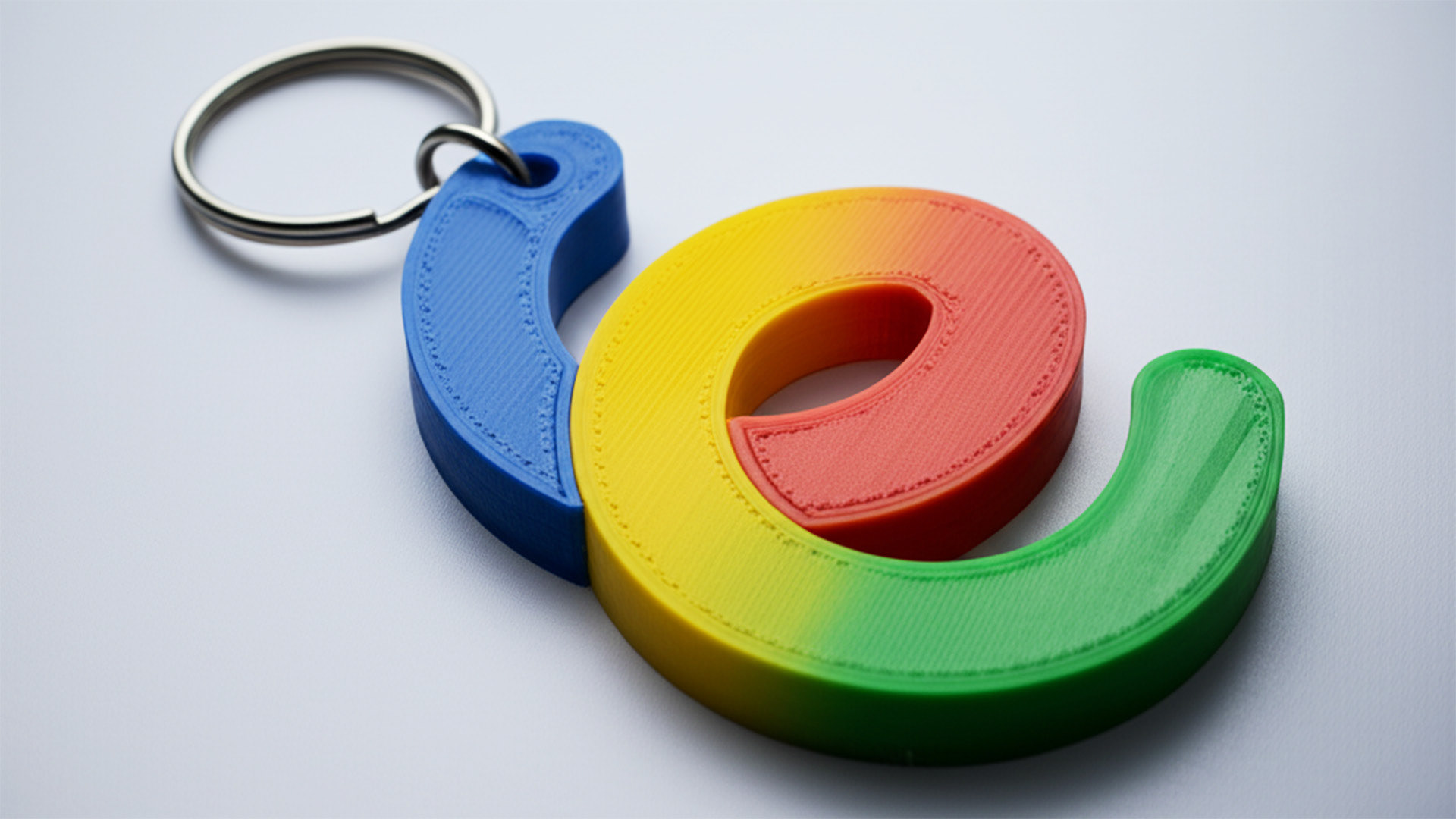
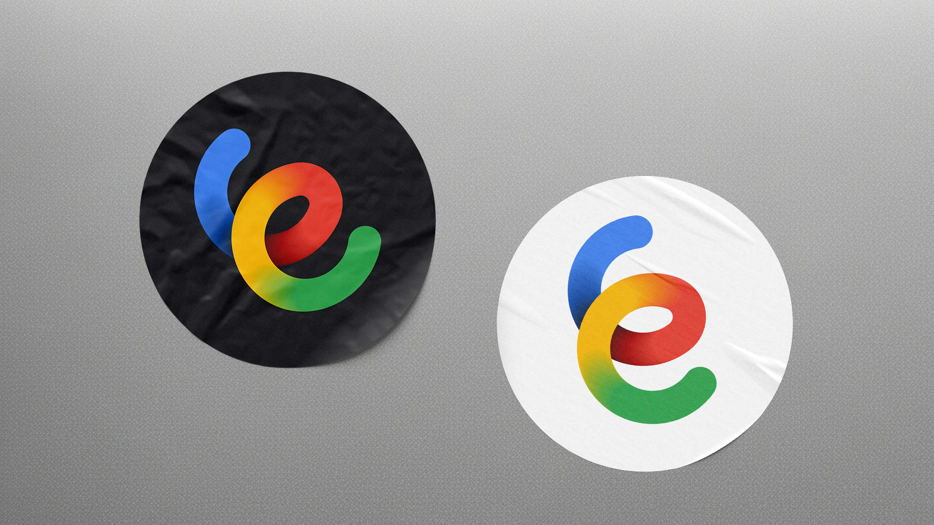
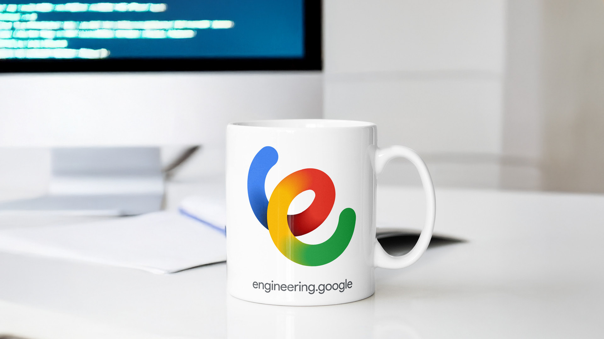
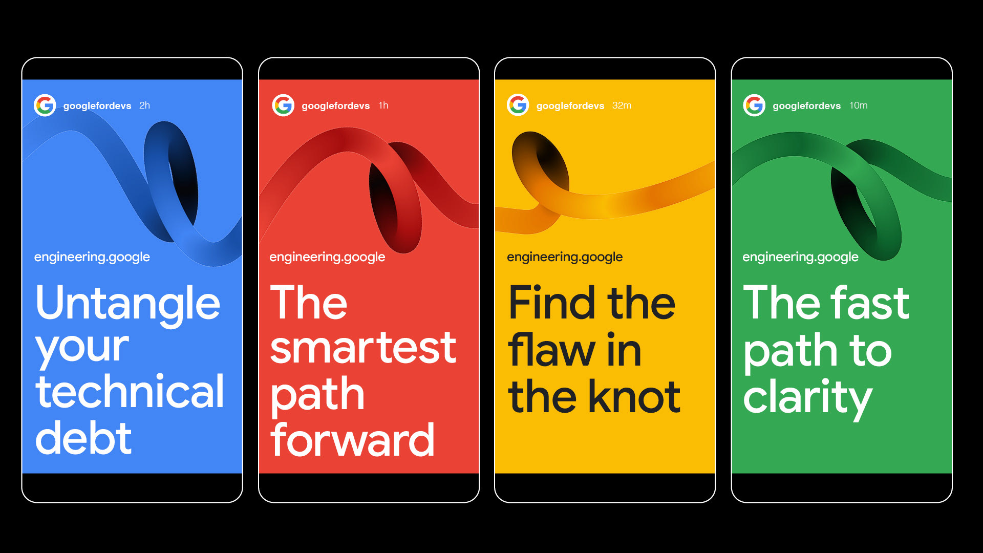
Color & Typography
The palette uses Google’s core colors but applies them in sophisticated gradients along the ribbon, symbolizing the journey from a complex problem to a clear solution. Typography is clean and direct, using Google Sans Medium.
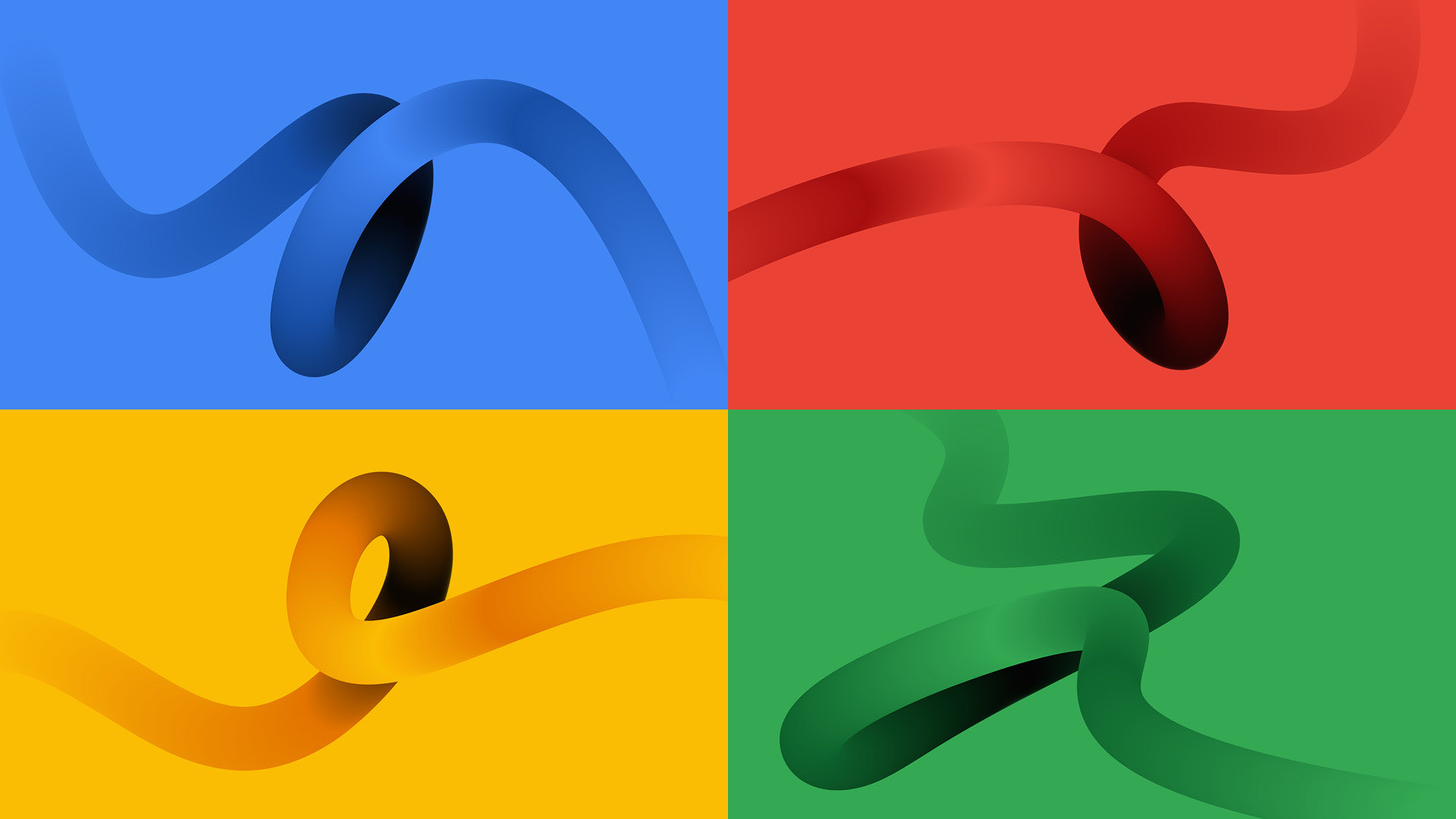
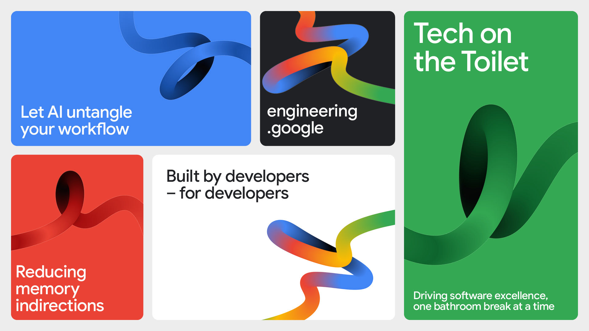
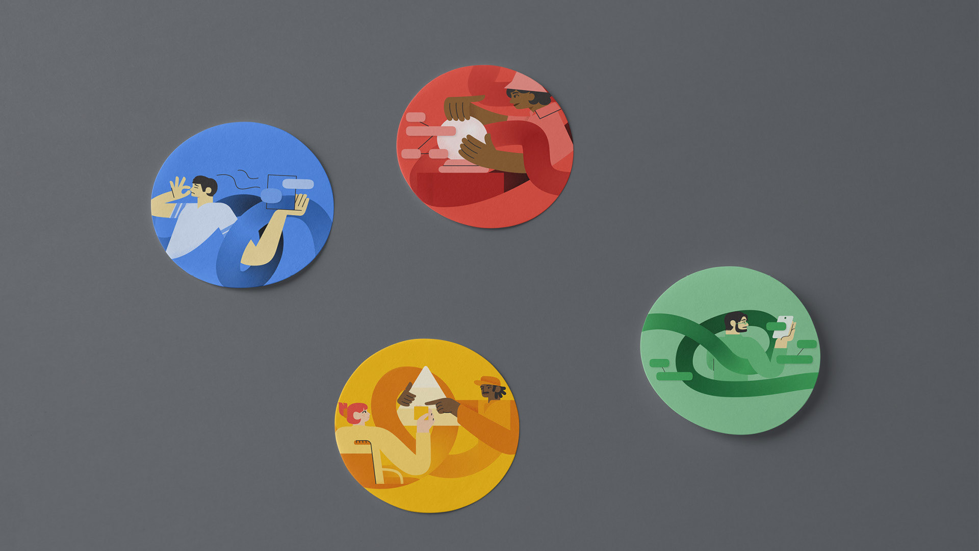
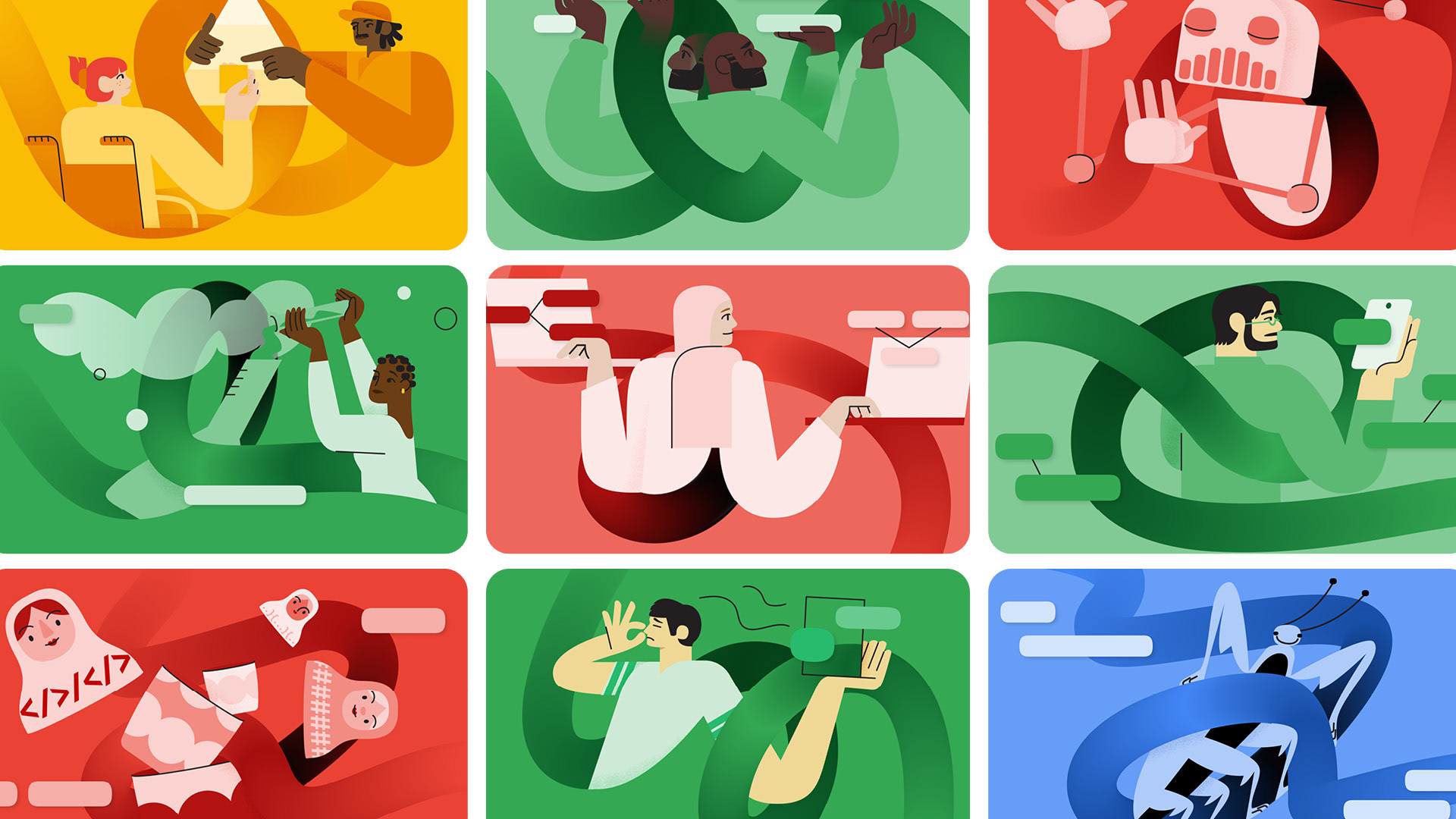
Illustration:
A human-centric system
A human-centric system
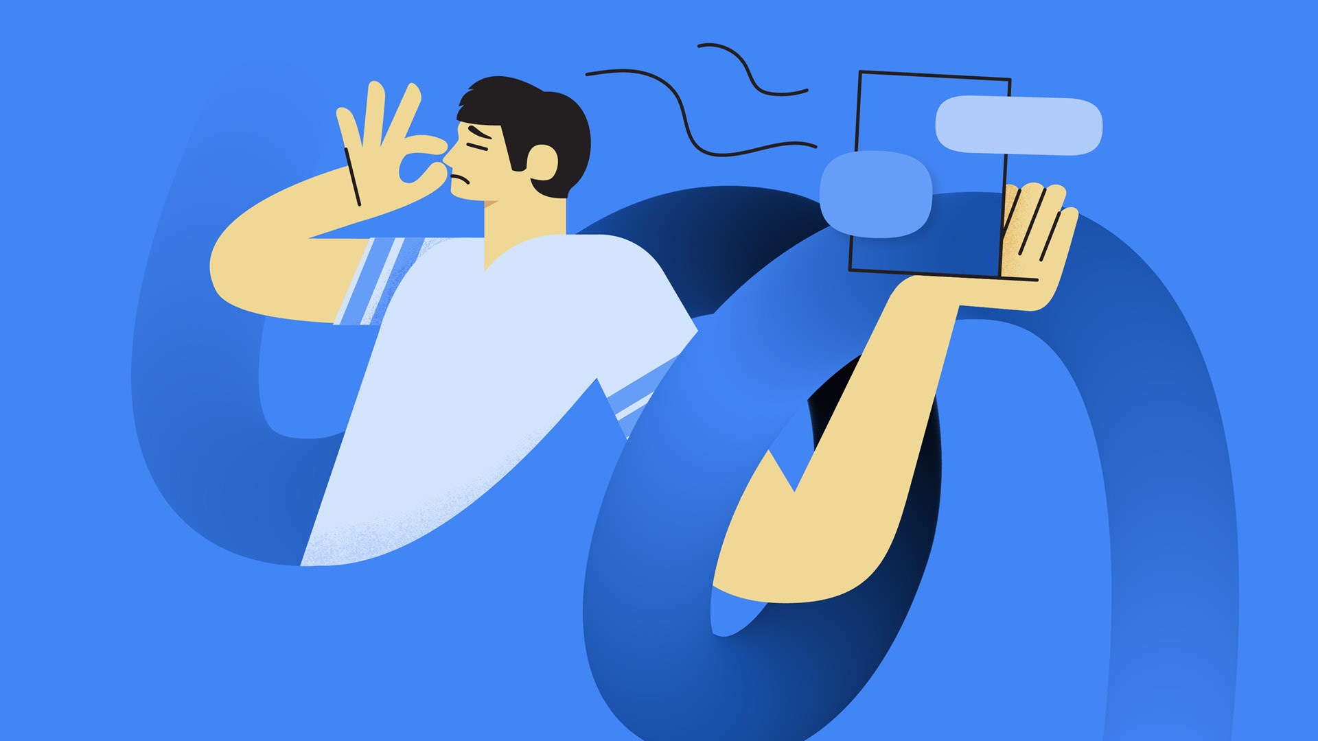
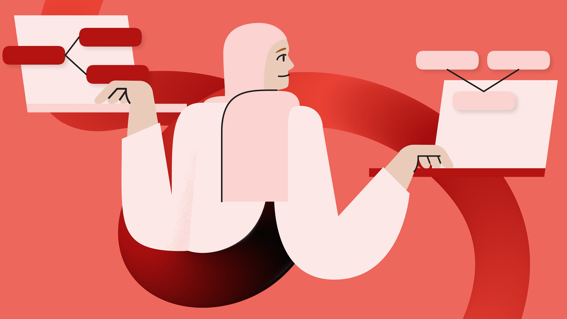
The illustration style is a direct extension of the core brand idea. Its primary objective is to be a relatable and human-centric resource for the developer community.
The Knot as a narrative device:
The core graphic device – the “knot” – weaves through each composition, tying the visual narrative directly into the brand story. Characters and objects interact with the knot, visually representing the process of working through and solving complex problems.
The core graphic device – the “knot” – weaves through each composition, tying the visual narrative directly into the brand story. Characters and objects interact with the knot, visually representing the process of working through and solving complex problems.
Relatable storytelling:
The style uses a mix of approachable human characters and abstract metaphors to explain technical topics. For example, a bug illustrates code complexity, Russian dolls represent memory indirections, and a robot visualizes automation.
The style uses a mix of approachable human characters and abstract metaphors to explain technical topics. For example, a bug illustrates code complexity, Russian dolls represent memory indirections, and a robot visualizes automation.
Authentic representation:
A core tenet is the diverse and authentic portrayal of people. Guidelines ensure variety in all features, and elements like hearing aids or wheelchairs can be included in a natural, subtle way to reflect the real world. Linework and subtle textures are used sparingly, only to add clarity and depth where needed.
A core tenet is the diverse and authentic portrayal of people. Guidelines ensure variety in all features, and elements like hearing aids or wheelchairs can be included in a natural, subtle way to reflect the real world. Linework and subtle textures are used sparingly, only to add clarity and depth where needed.


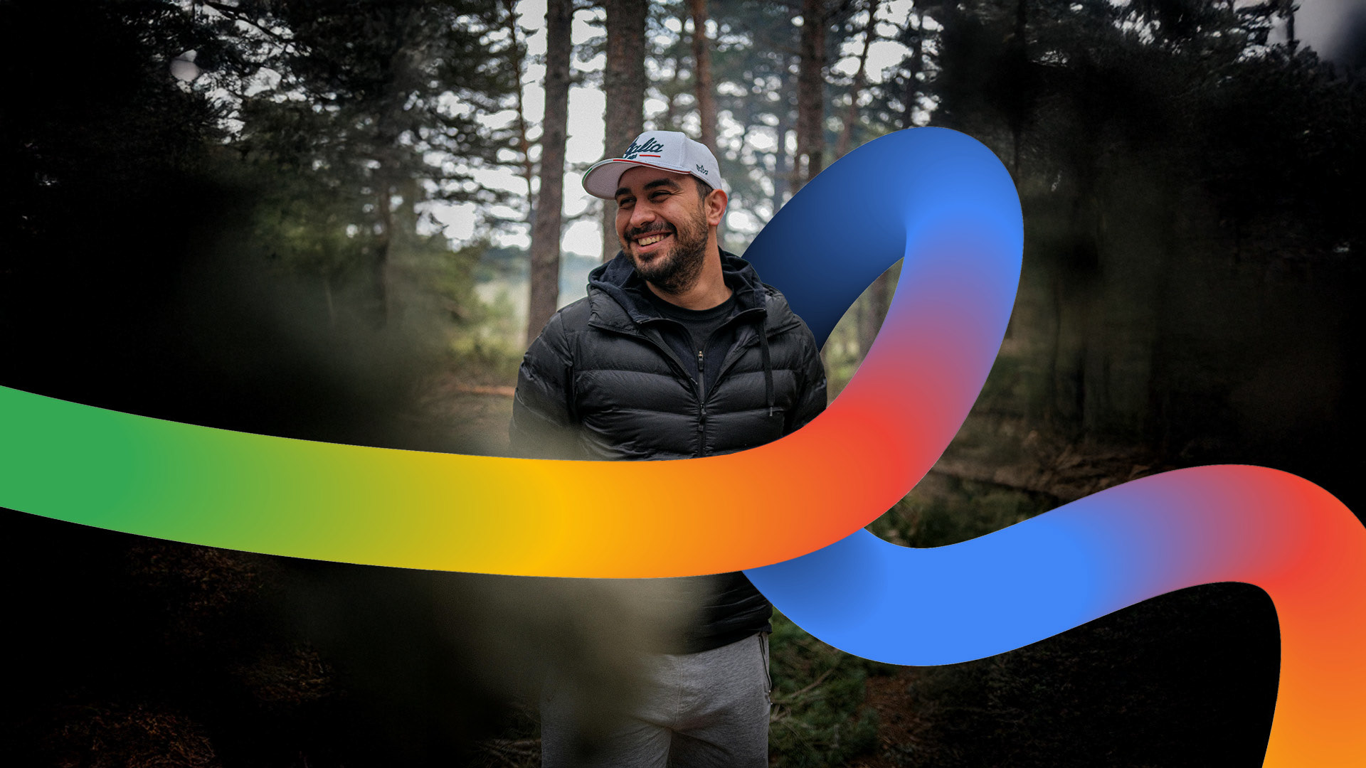
Photography
The photography focuses on authentic moments, featuring the real people who make up the developer community.
The “untangling line” is overlaid as a dynamic graphic device, interacting with the subjects to create a branded feel that connects human experience with the act of creation.

Brand in action
The final system was rolled out across all touchpoints
to create a cohesive, engaging, and distinctly human
brand experience.
to create a cohesive, engaging, and distinctly human
brand experience.
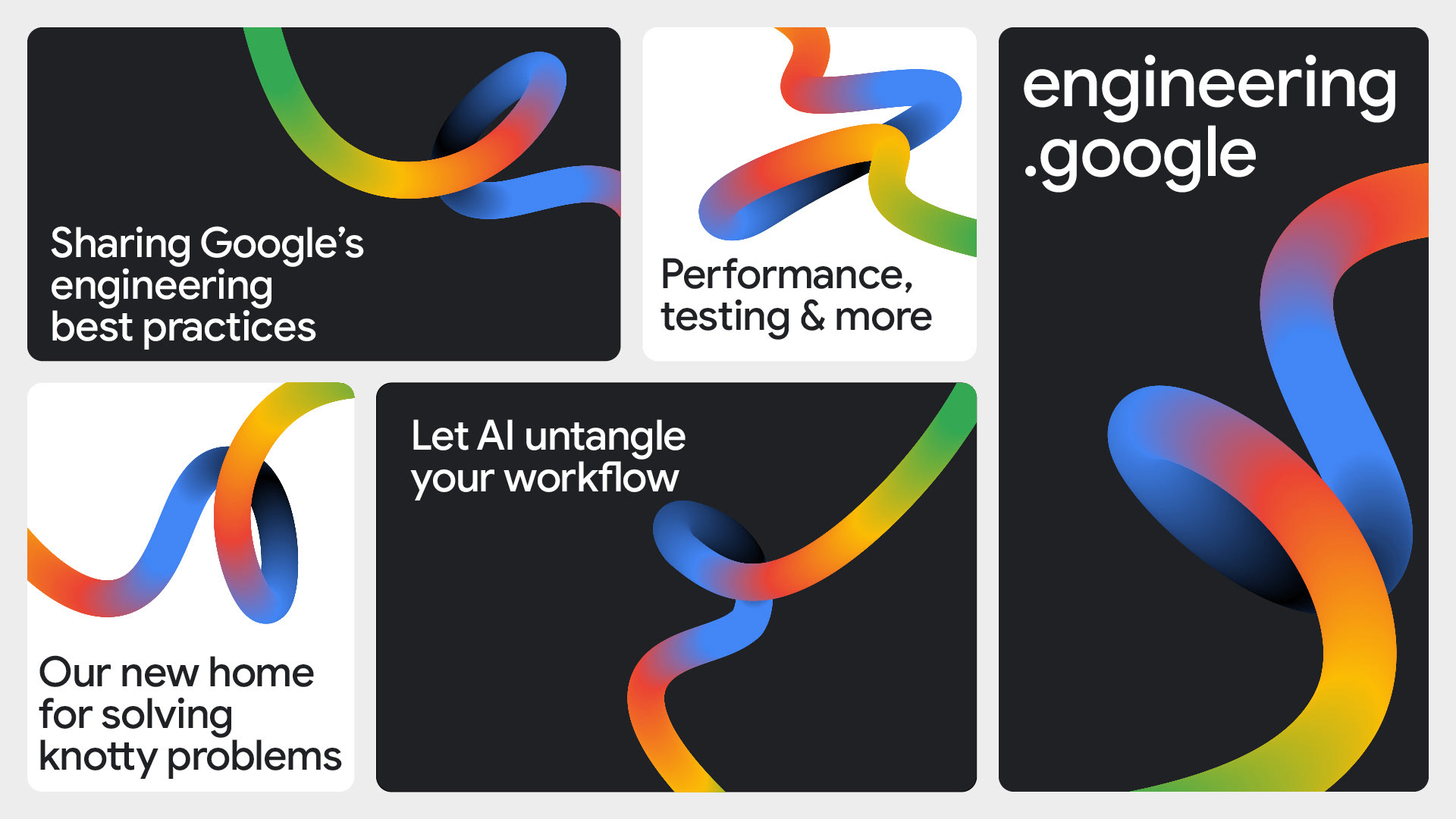
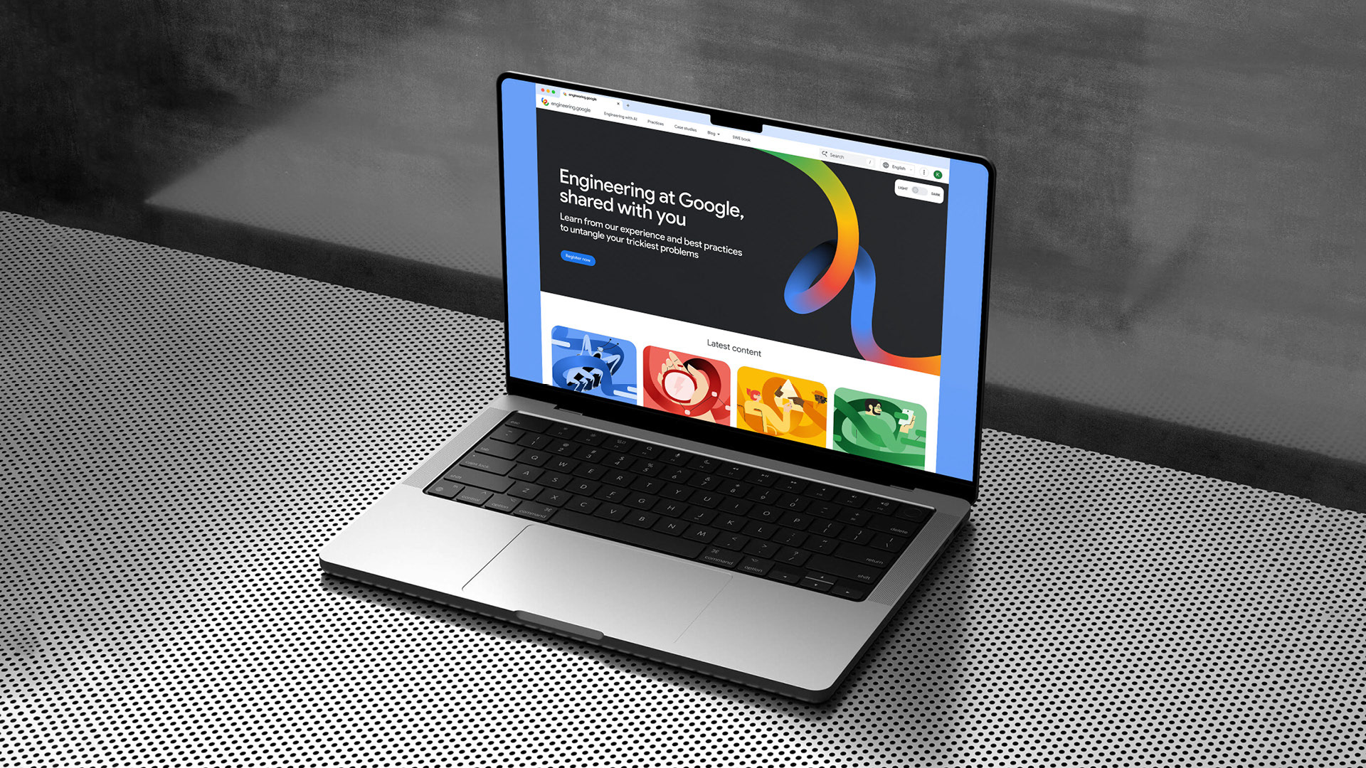
Website
The brand’s primary home is clean and focused, using the graphic device and color-coded illustrations to guide users through content pillars like Testing, Code Health, and AI.
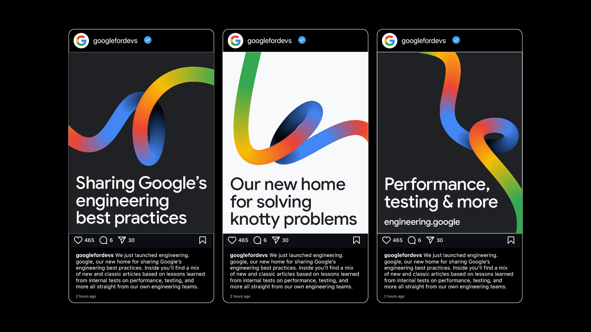
Social Media
The identity is designed to be instantly recognizable in social feeds, using bold color, dynamic motion, and the core ribbon graphic to capture attention and convey information clearly,
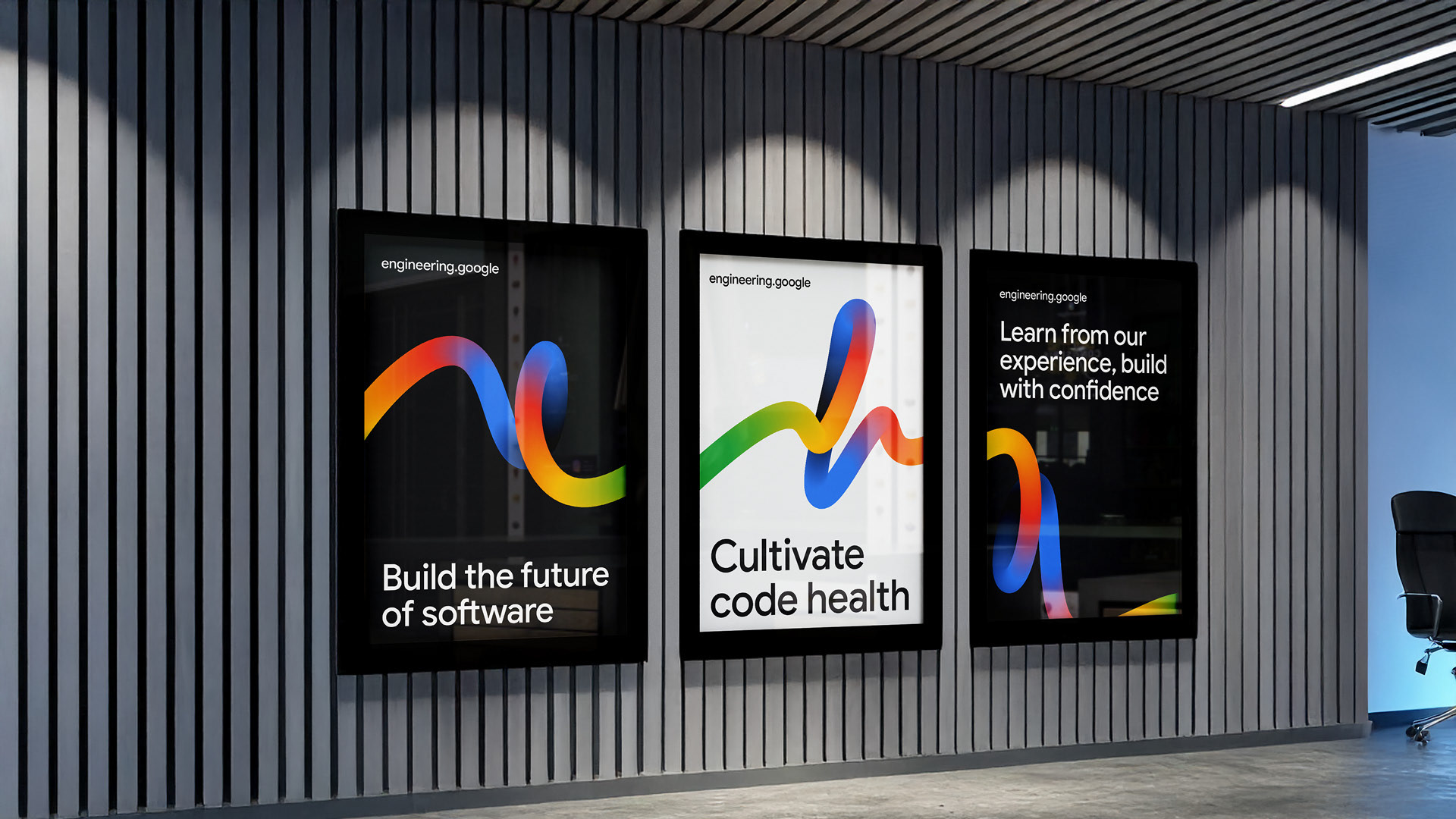
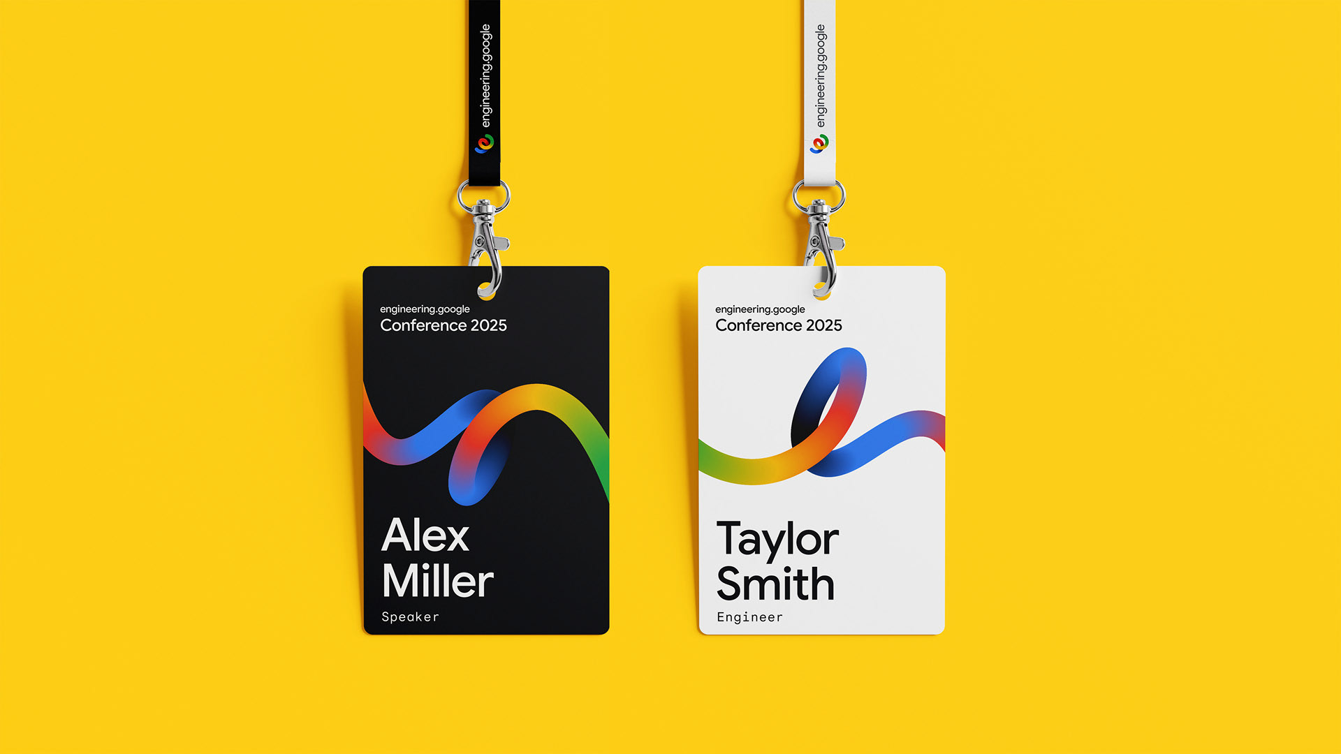
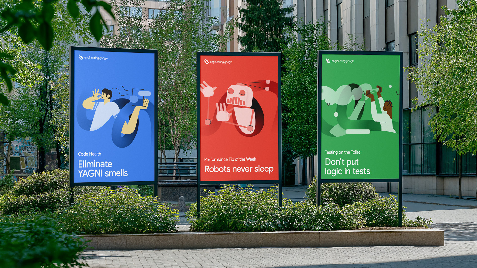
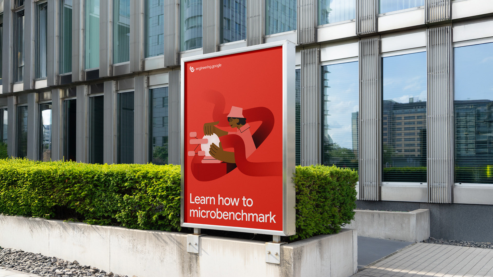
Events & OOH
In the physical world, the brand makes a confident statement, using the vibrant ribbon and clear messaging to create memorable experiences at events and in outdoor advertising.
.
Client
Google for Developers
Associate Creative Director
Brand Strategy, Brand Design & Motion Design
Andy Lawrence-Levy
Marketing Manager
Caio Avelar
Caio Avelar