

Healius
.
Agency
FutureBrand
Role
Lead Brand Design
Lead Motion Design
Art Direction
Brand Architecture
Awards
Transform Awards 2020
Bronze for ‘Best Brand Architecture solution’
FutureBrand
Role
Lead Brand Design
Lead Motion Design
Art Direction
Brand Architecture
Awards
Transform Awards 2020
Bronze for ‘Best Brand Architecture solution’
.
.
Background
Primary Health Care were a diversified healthcare service provider providing affordable and accessible healthcare to millions across Australia.
Primary Health Care were a diversified healthcare service provider providing affordable and accessible healthcare to millions across Australia.
Since the 1980s, they’ve grown to offer everything from diagnostic imaging and pathology to IVF and skin services, across 2,500 sites and 12,000 people.
Primary Health Care made a commitment to a future of healthcare that’s more collaborative, empathetic and connected.

.
Opportunity
They needed a new brand that was a clear symbol of change in the business, to bring trust and credibility to the positive transformations happening in the business.
The new brand needed to represent the quality of treatment and quality of service and great patient experience.
It also needed to connect the wide range of medical disciplines that were all disjointed.
The new brand needed to represent the quality of treatment and quality of service and great patient experience.
It also needed to connect the wide range of medical disciplines that were all disjointed.
.
The solution
We changed the name of the parent company from Primary Health Care to Healius. We also created new names for all its service brands that would be a catalyst for spreading this new perspective of healthcare.
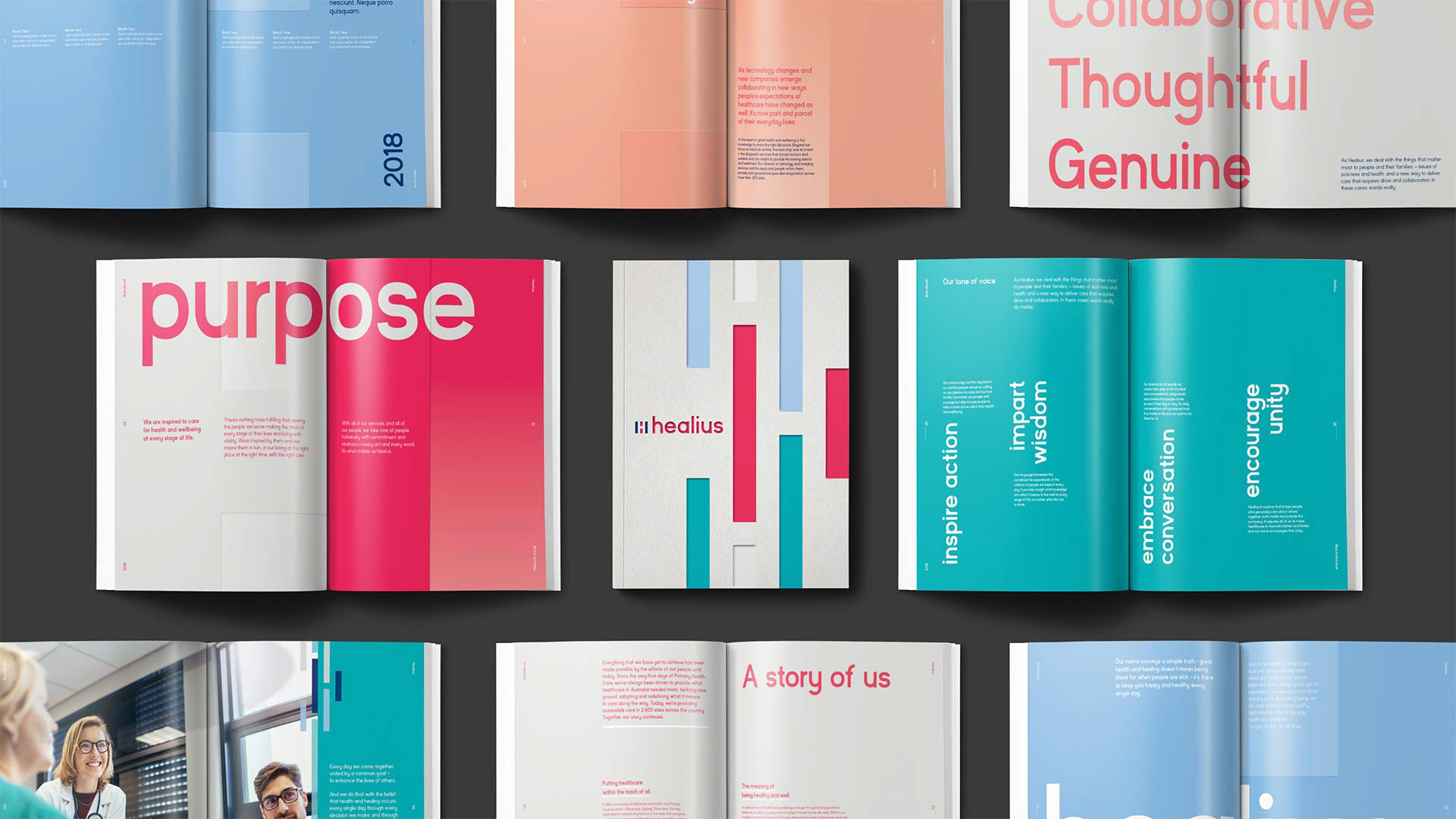
Created a new visual and verbal identity system to unite all the services.
These new systems also help push the commitment of being more collaborative, empathetic and connected.
Brand naming
We renamed the master brand as well as the service /sub-brand names.
The brief for the names was:
– Communicating togetherness and empathy.
– Approachable, warm and distinctive.
– Less corporate than previous names.
– Approachable, warm and distinctive.
– Less corporate than previous names.

Brand strategy
Before starting design, designers worked with strategists to map out the brand portfolio. We found a way to create a connected experience with the company and all its services / sub-brands.

Brand architecture
We decided to go for a visually connected brand architecture.
The brandmarks are all visually aligned. Each service has different personality, so they all have unique names.
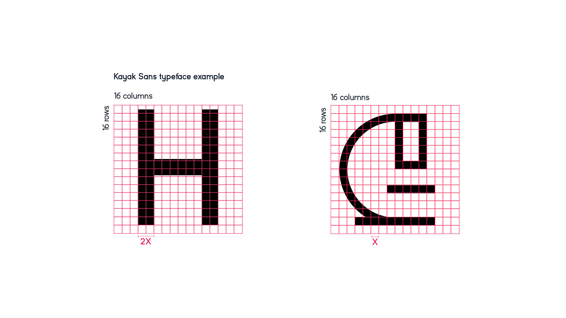
Each brand mark has a word mark typeset in a highly legible typeface which was chosen for its warmth, paired with a unique symbol.
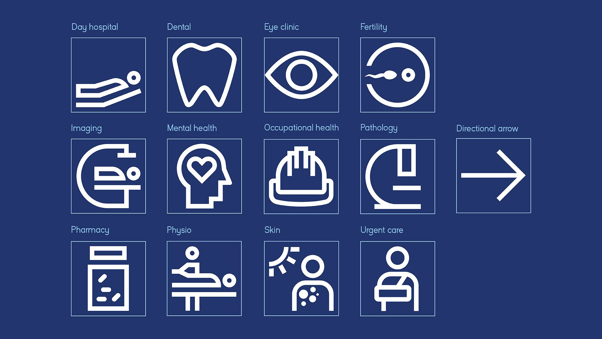
The unique symbols are used as shorthand when necessary for each service. Each is an abstract letter and reflects the service provided.
Master brand
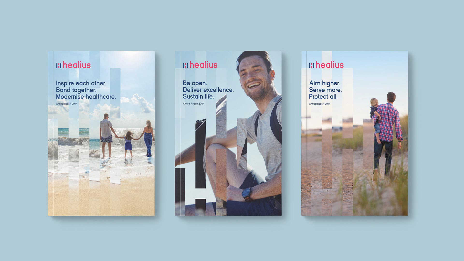
Healius
Healius
Starting with the company itself. The main target audience are the staff members and medical professionals.
It is the masterbrand which affects all of the services beneath it.
It is the masterbrand which affects all of the services beneath it.
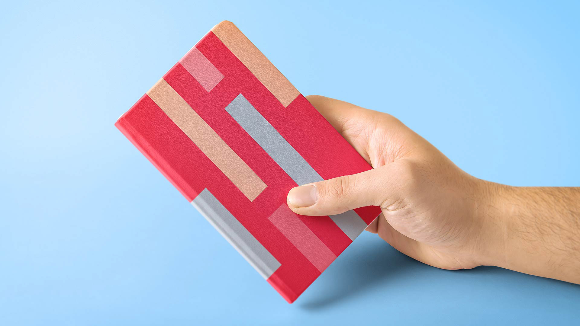
The H symbol represents collaboration.
Graphic language was based off the H symbol for collaboration but by using this H and connecting it together into a pattern represents connection of all the services that the company offers, working together as one organisation.


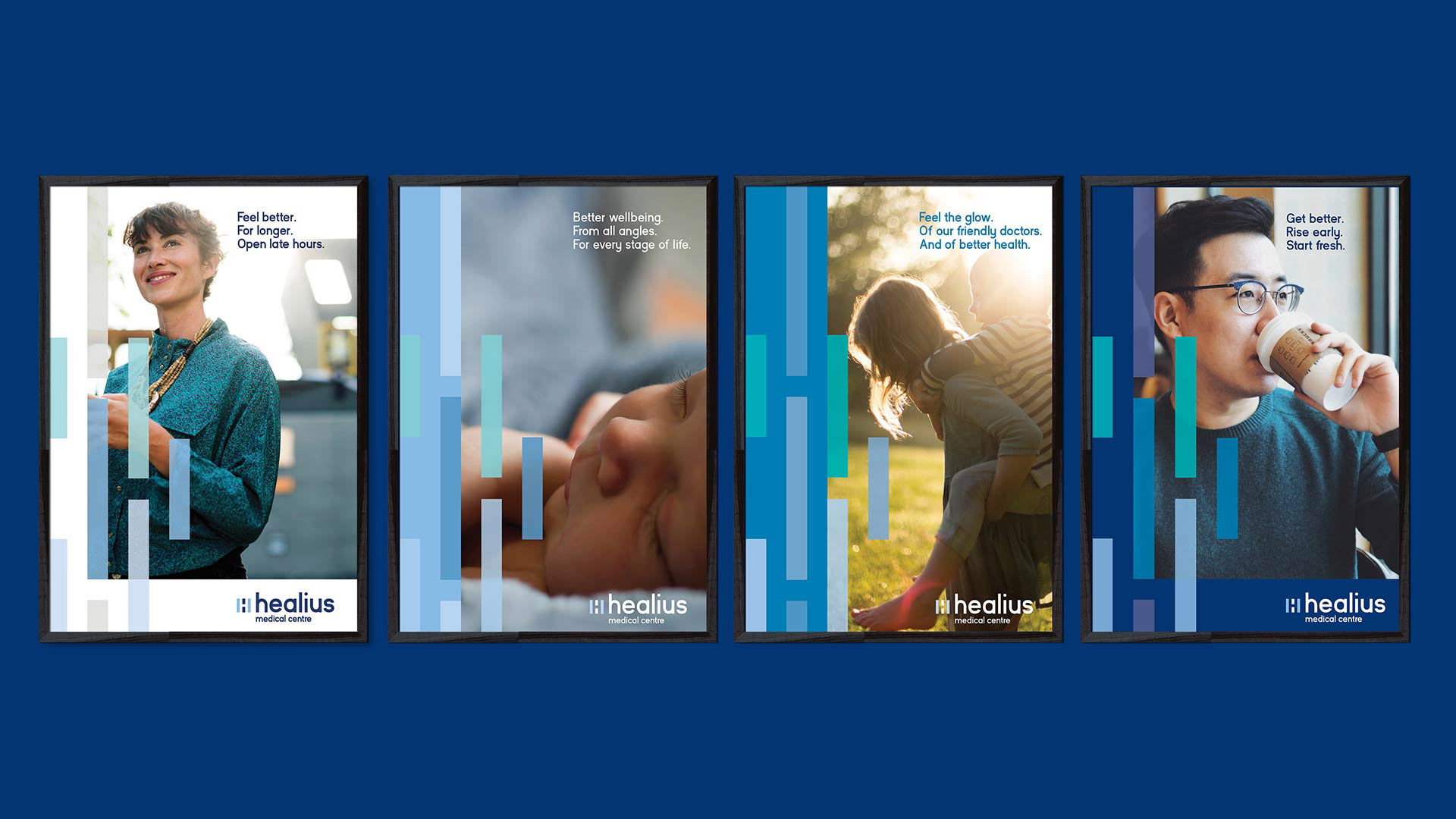
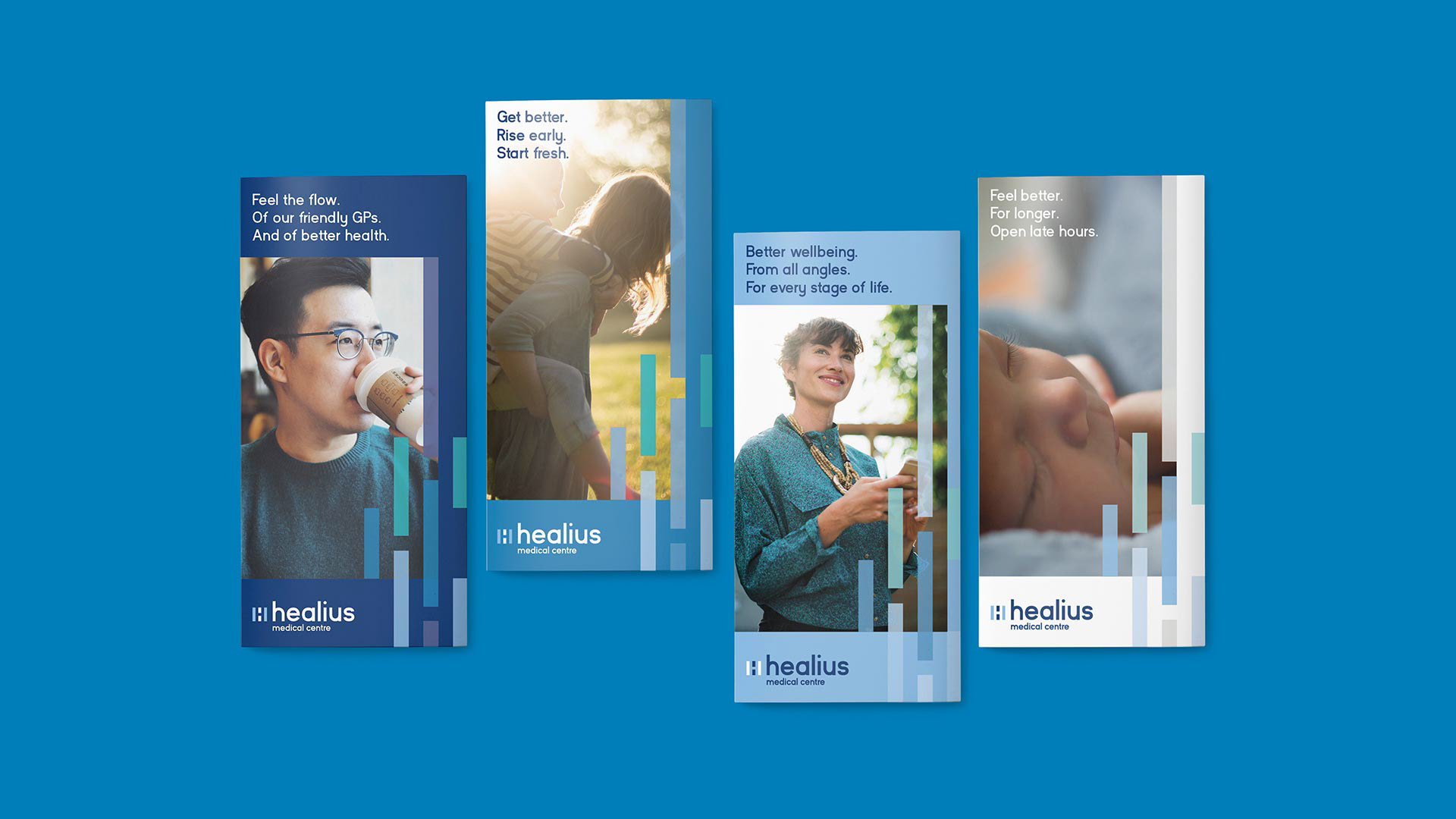
Photography: Feeling warm and caring. Genuine and real. Open and honest
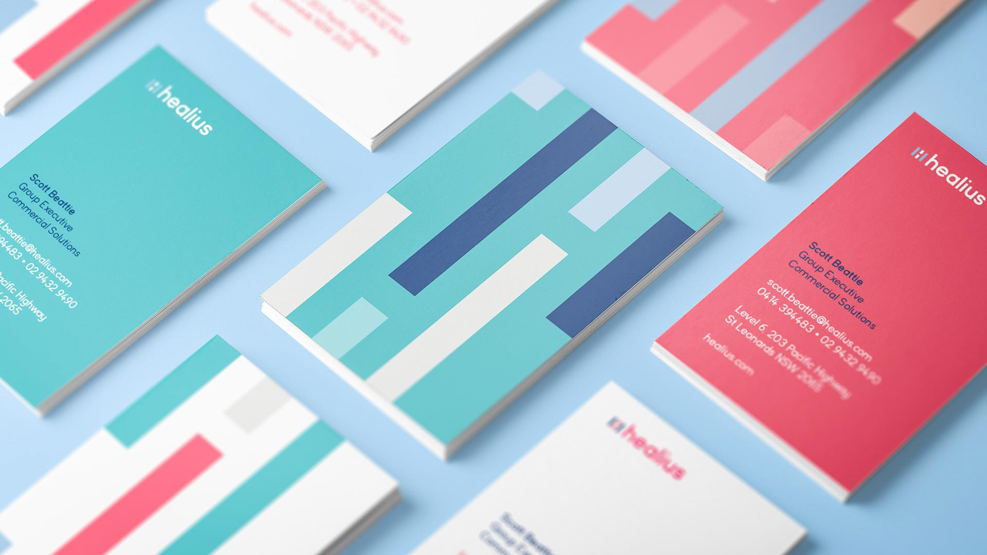
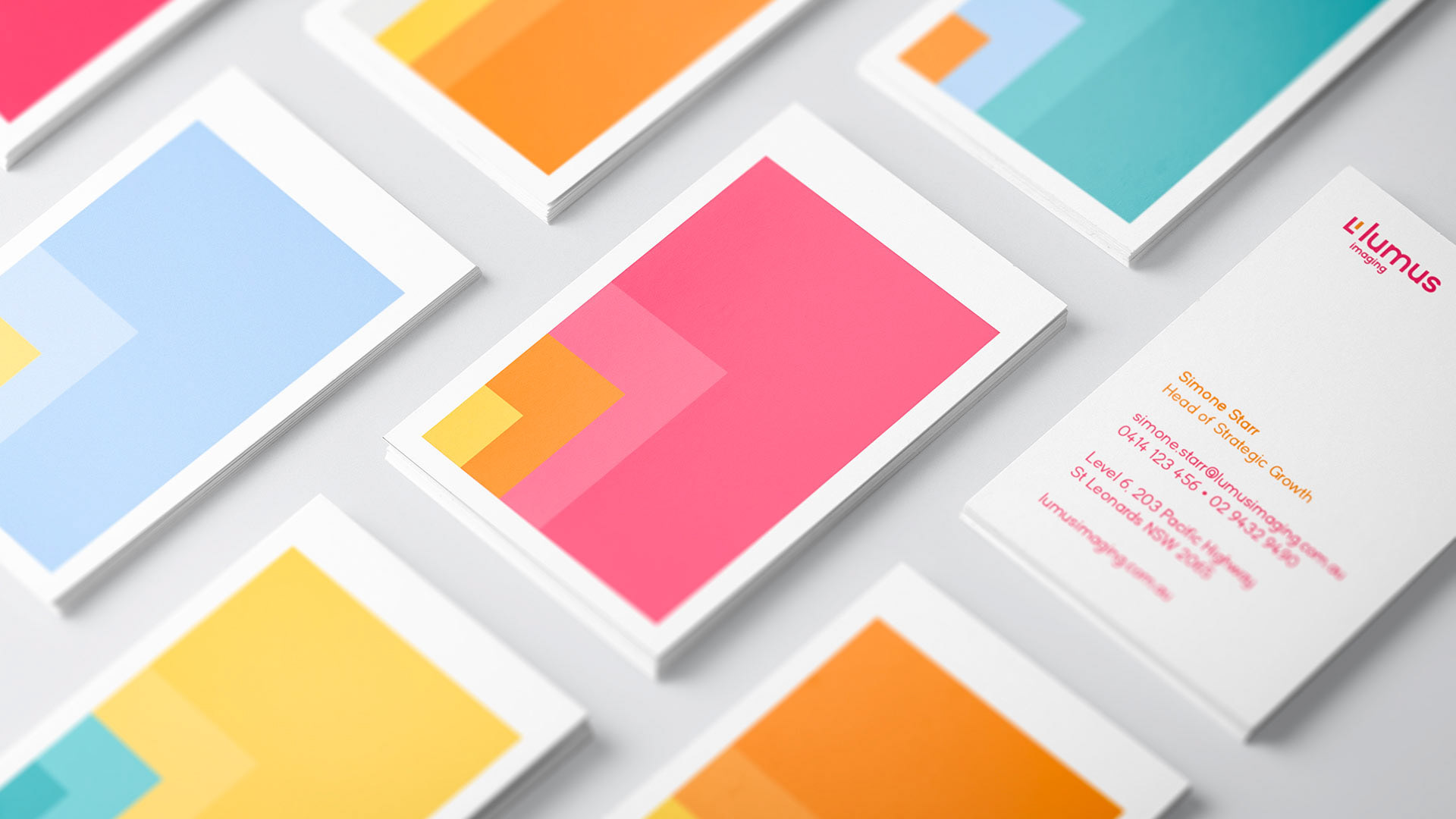
Business cards: Showing the flexibility of the system. Bold and impactful make staff proud to work there.

Employee engagement: Finding ways to be better to employees.
Such as creating onboarding material to remind staff on the positive work they are doing.
Such as creating onboarding material to remind staff on the positive work they are doing.


Sub-brand 01
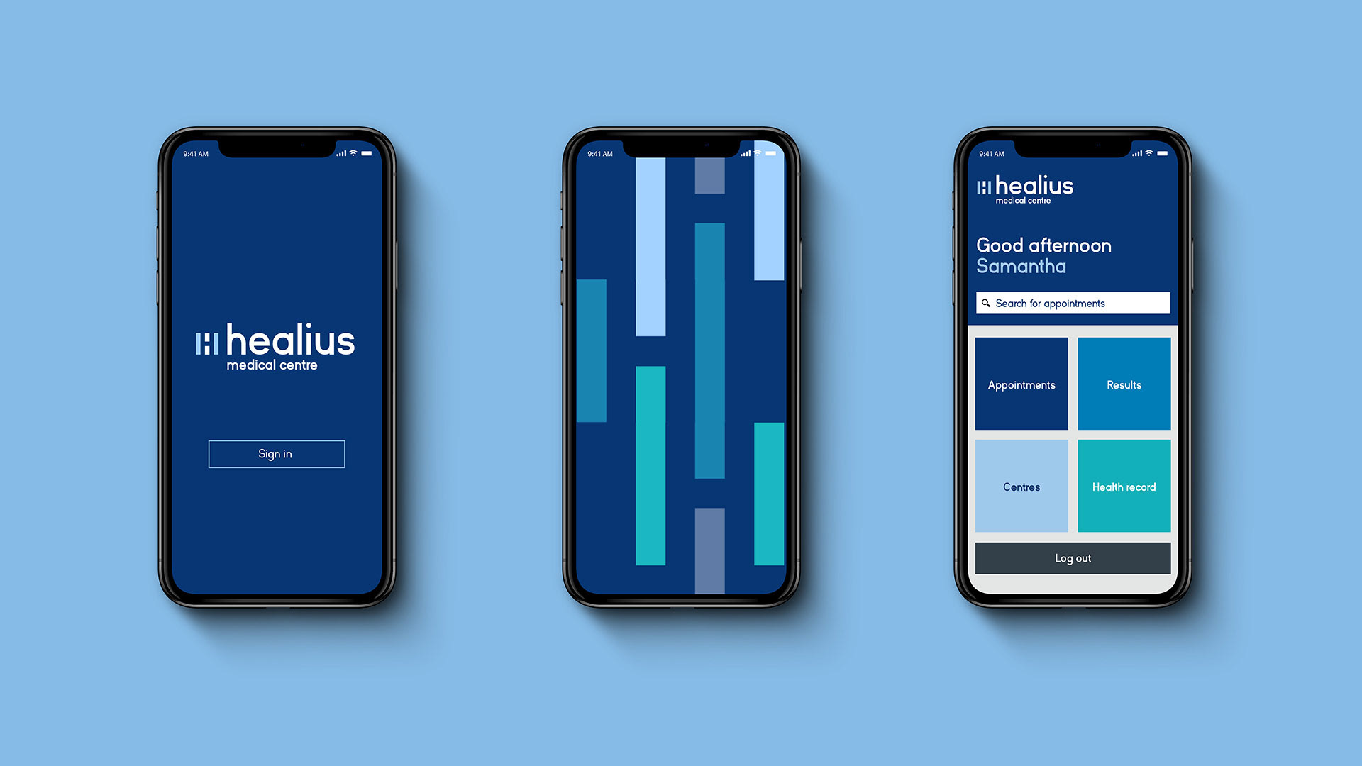
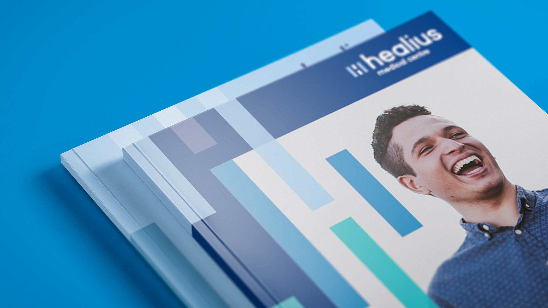
Healius Medical Centre
Healius Medical Centre
Healius Medical Centres are the consumer facing part of the brand. It's similar to the corporate brand, but with a different target audience.
Previously known as Primary Medical Centres.

H pattern also used for Medical Centres – but with a blue colour palette.
The blue palette was chose for several reasons:
1) To keep costs down as most were already blue.
2) Represents cleanliness and hygiene
3) fairly neutral to allow the other colours from sub-brands to shine
1) To keep costs down as most were already blue.
2) Represents cleanliness and hygiene
3) fairly neutral to allow the other colours from sub-brands to shine


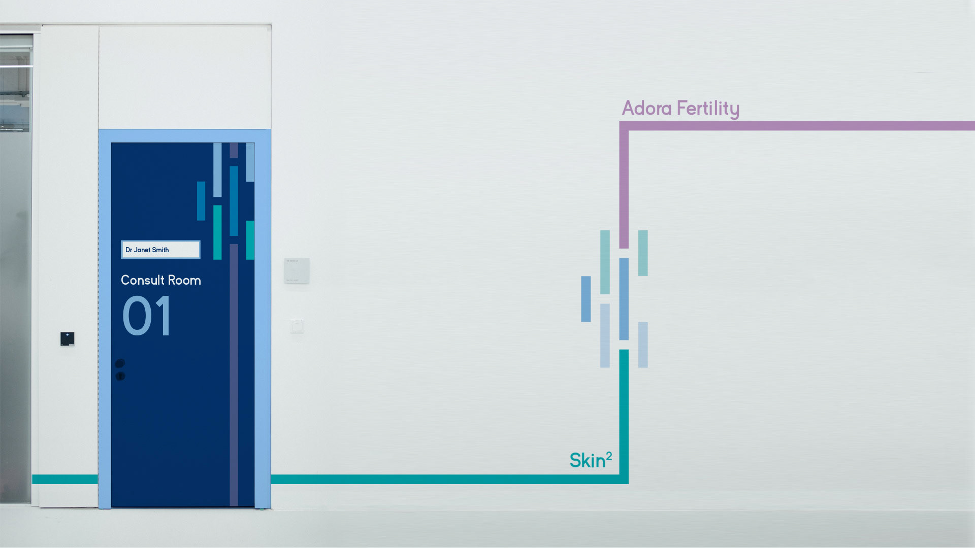
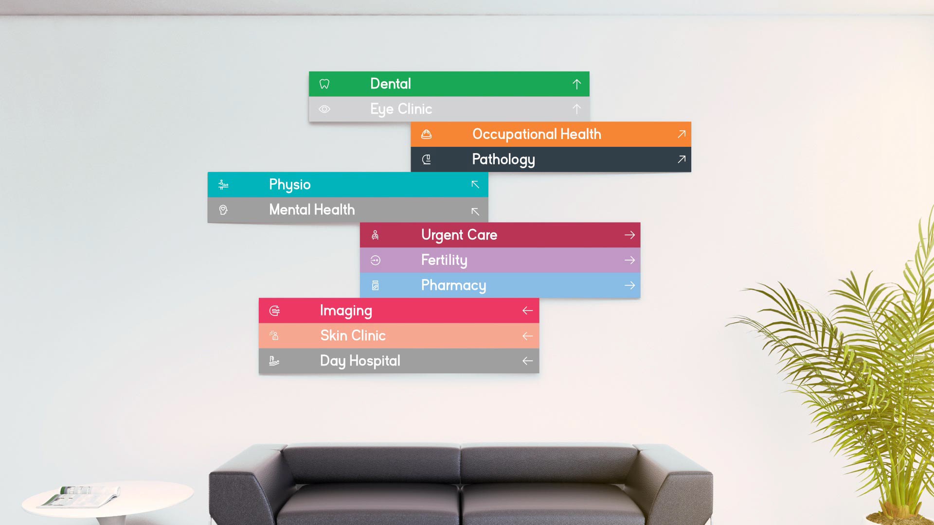
H patterns used as both decorative device to make the medical centres feel warmer and more inviting.
But also for practical reasons, such as for wayfinding to the different services
But also for practical reasons, such as for wayfinding to the different services

Sub-brand 02
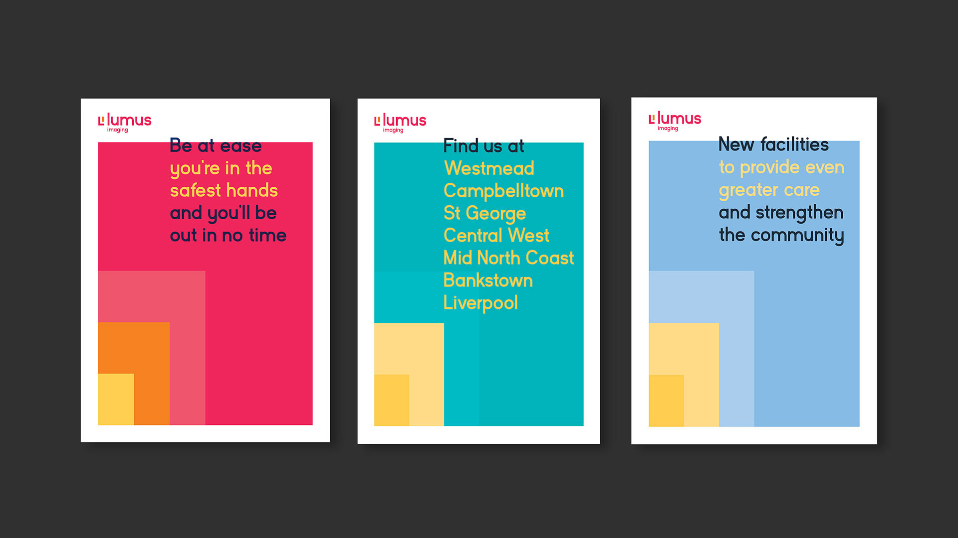
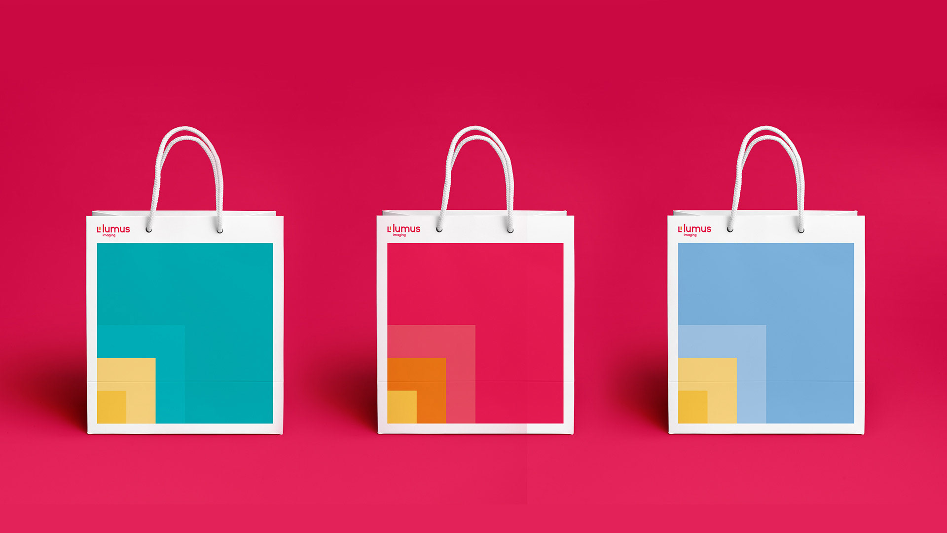
Lumus Imaging
Lumus Imaging
The next part of the project was to define and rename the Healthcare Imaging Services brand to Lumus Imaging.
Imaging is about focusing on the small details in the lab, looking at X-rays and scans to find out what’s wrong with people. The L symbol represents focusing in on the detail.

.
Creative Rationale
At Lumus we focus on the details, but we don’t get lost in the detail. We have the empathy and expertise to look at the whole person, enabling better diagnostics, treatments and outcomes.
And whilst everyday we are called on to look at the finest line in a bone, the tiniest dot on an MRI, or an unassuming smudge on a scan we know that these small details are just as important as the bigger picture – the patient and the impact these results may have on their future.


Verbal language: Links to bigger picture too.
First section is the detail – what they do: Pocket-sized ultrasounds.
Second section – positivity: to make the right decisions
Last section – the bigger picture: that get people on the mend.
First section is the detail – what they do: Pocket-sized ultrasounds.
Second section – positivity: to make the right decisions
Last section – the bigger picture: that get people on the mend.

Photography: Reminding us about the bigger picture, the result. Feeling warm and caring

Sub-brand 03
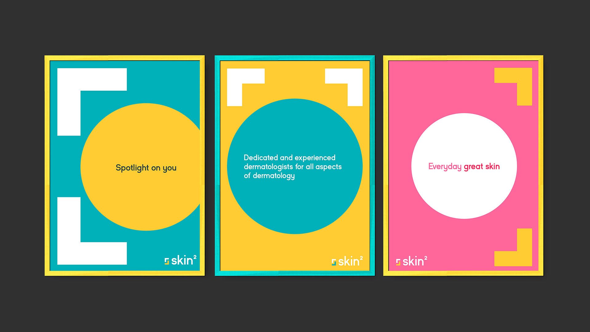
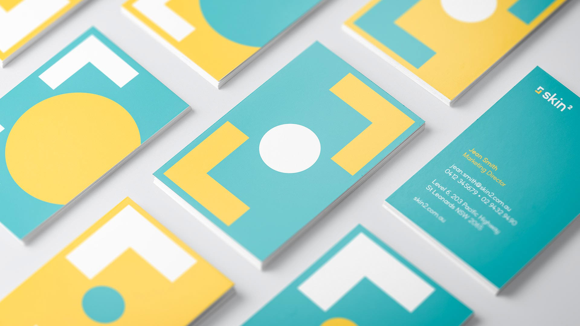
Skin Squared
Skin Squared
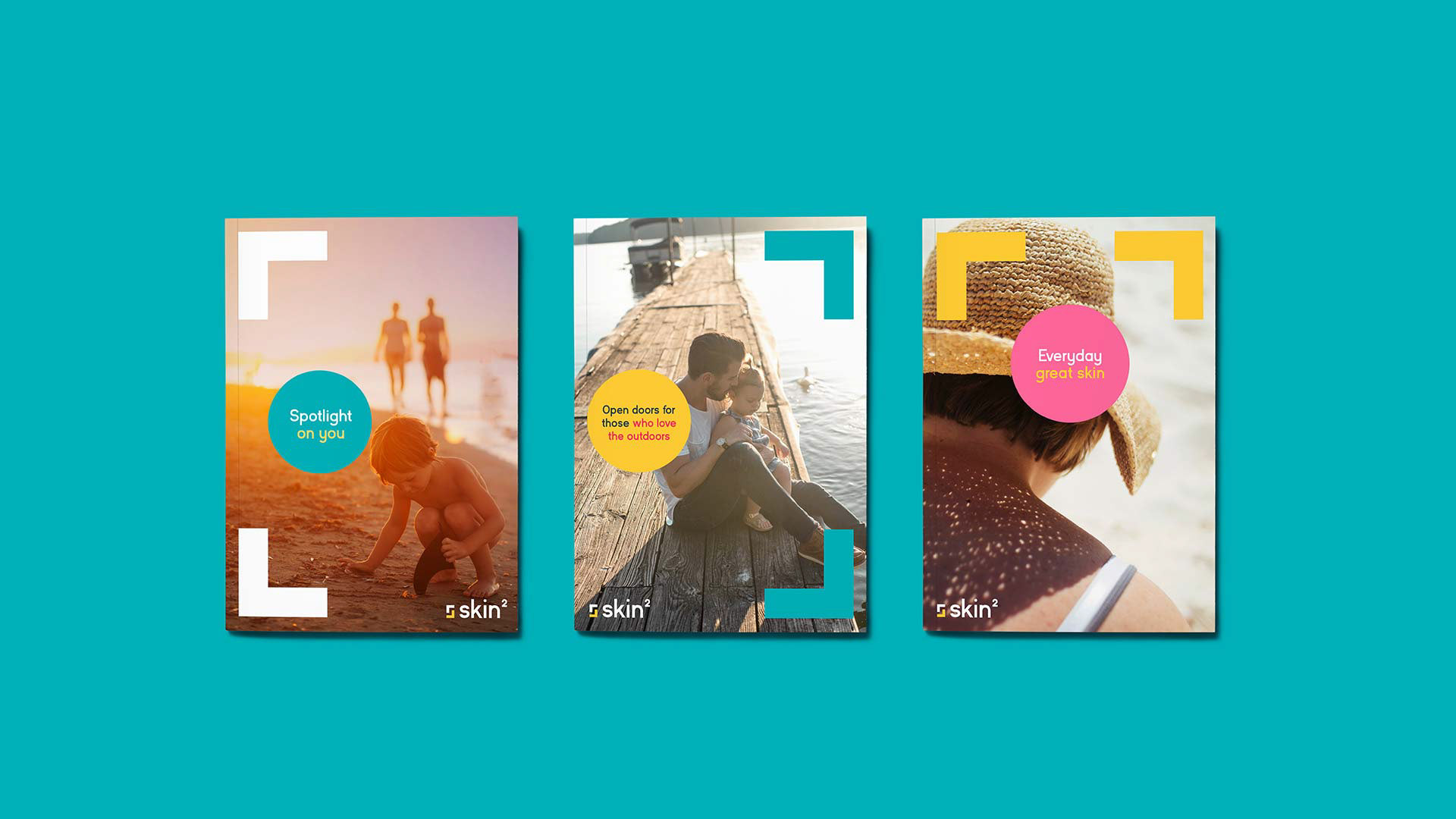
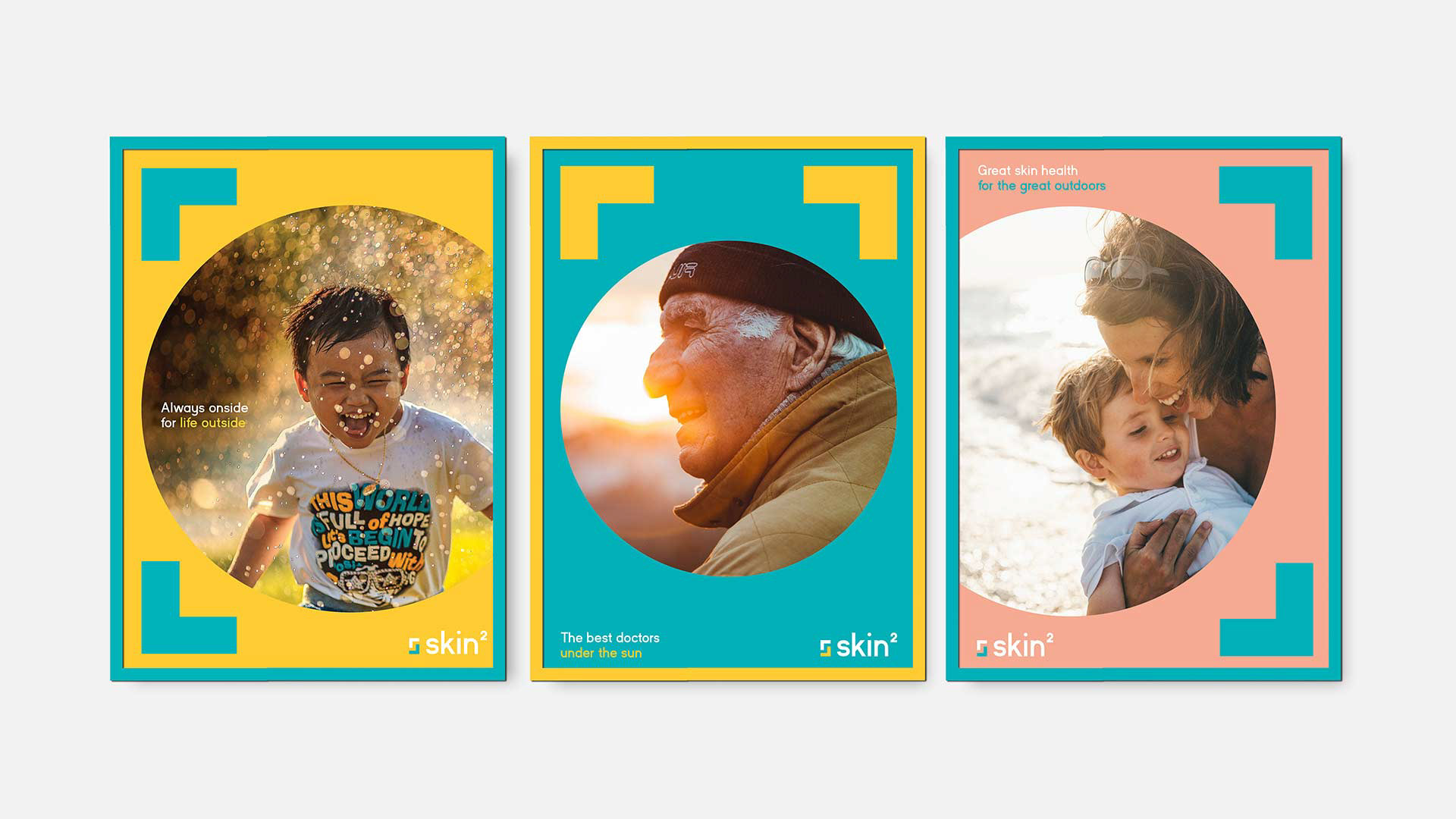
The next part of the project was to create a new identity for a new skin cancer and health brand, which had been given the name "Skin Squared".
These new clinics were to highlight and use the existing expertise of the skin specialists already housed within the former Primary Medical Centres.

.
Creative Rationale
In Australia we are blessed with an abundance of great weather –big blue skies and long sunny days.
But this does come with a downside – the sun is detrimental to our skin.
But this does come with a downside – the sun is detrimental to our skin.
By equipping our clinics with highly trained, personable doctors and specialists, we give you the tools and the care needed to make the most of the great outdoors, whilst enjoying good health, everyday.
At Skin2 we focus in on the details with care and precision.

Sub-brand 04
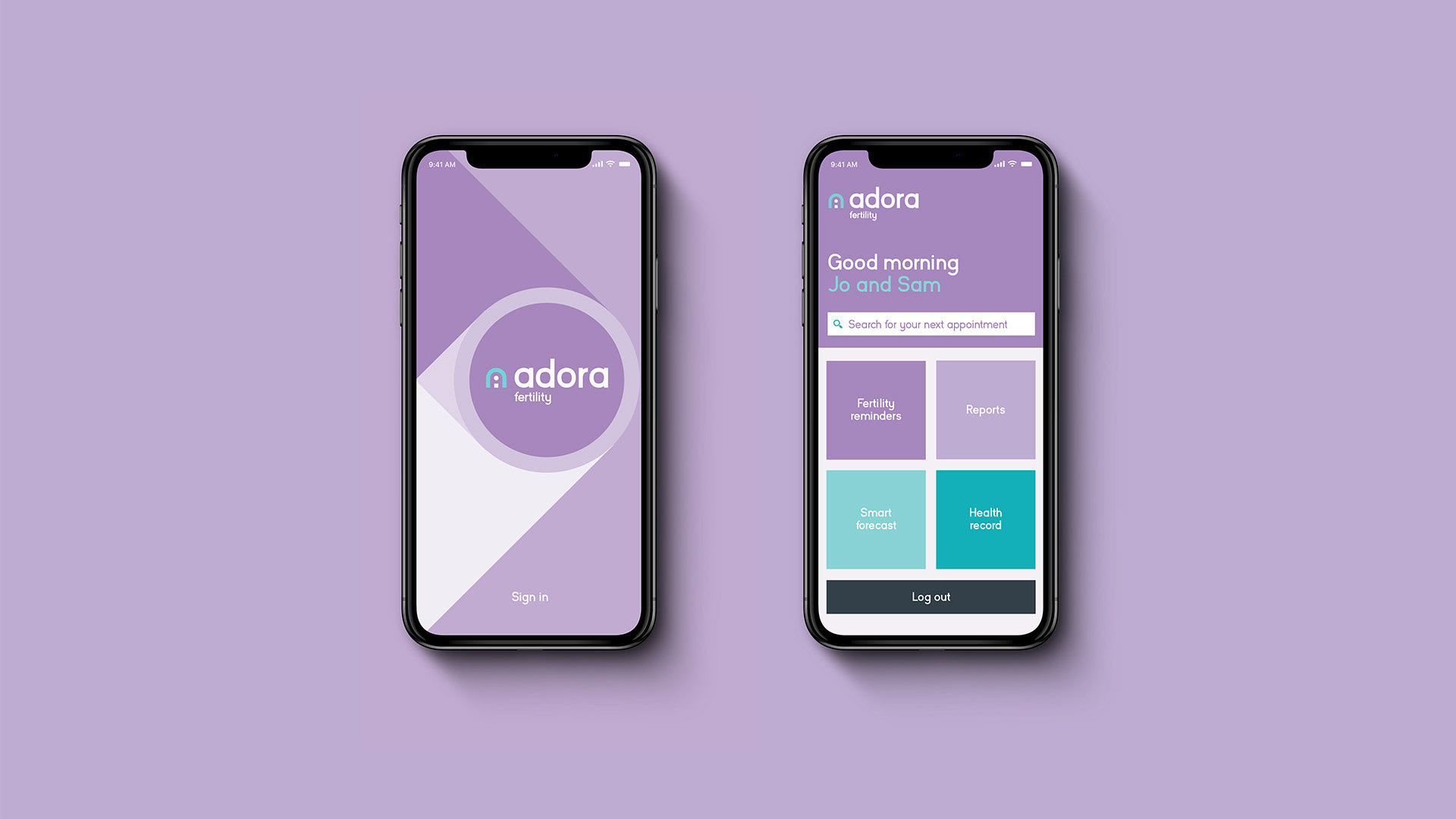
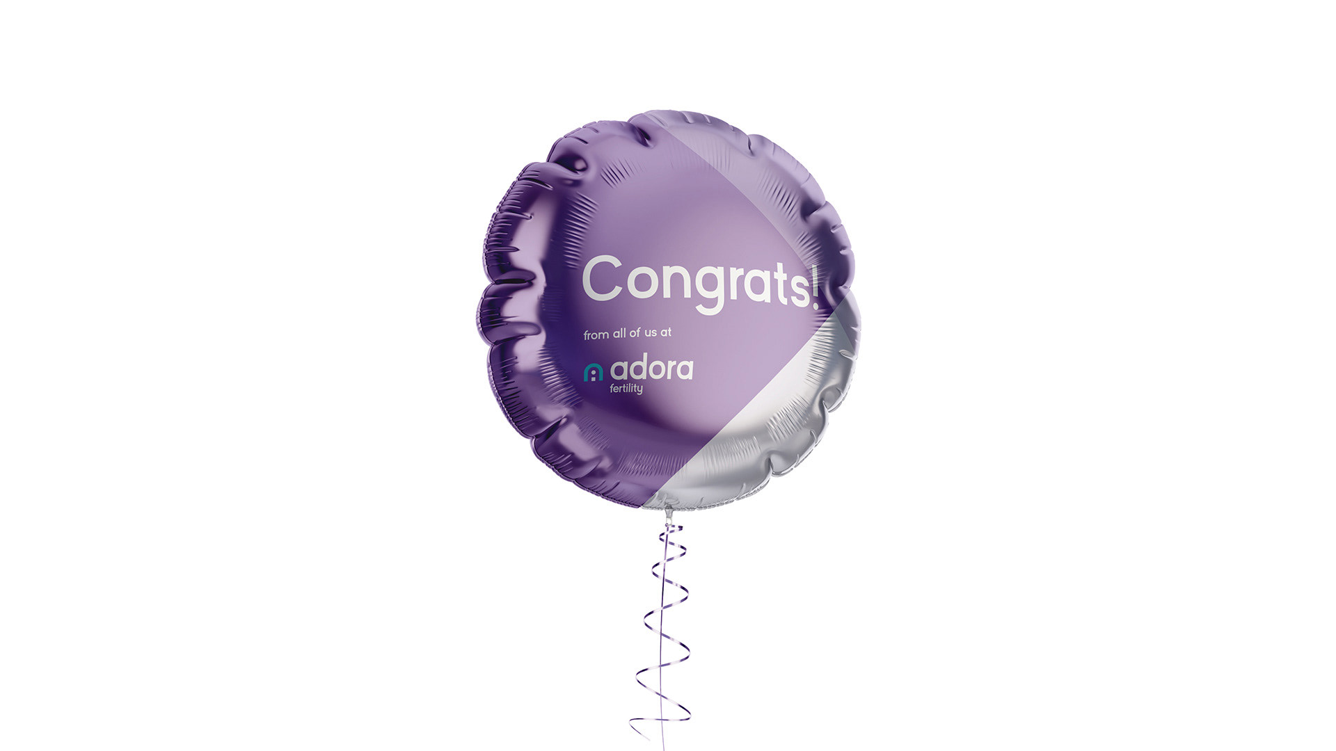
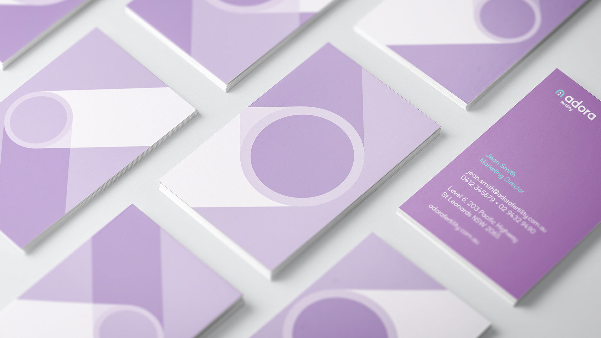
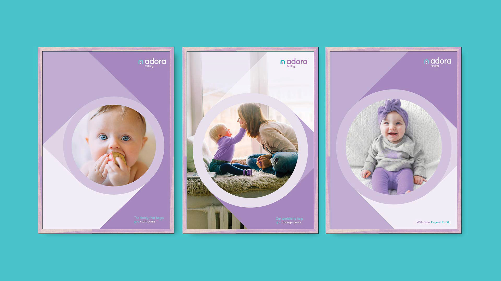
Adora Fertility
Adora Fertility
The next part of the project was to define and rename Primary IVF.
Adora Fertility is Australia's fastest growing provider of IVF, leading the way in making fertility treatment available for all those who need it.
It provides a cheap, but high quality alternative to the traditionally expensive IVF and fertility centres.

.
Creative Rationale
A baby can be lifelong dream. But for some it’s a dream that feels out of reach. Adora Fertility shines the light on your hopes and helps bring them closer.
By being focused, straight to the point and efficient we have levelled the playing field and opened the door to couples facing fertility challenges. We are the family that helps you start yours.

Results
Helped reinvigorate the organisation.
Put patient experience at front and centre and future-proofing it for years to come.
Become a clear signal of transformation of the company and industry as a whole.
.
.
Client
Healius Ltd [previously Primary Health Care Ltd]
Agency
FutureBrand
FutureBrand
Creative Direction
Nerida Murphy
Lead Brand Design / Motion Design / Visual brand architecture
Andy Lawrence-Levy
Nerida Murphy
Lead Brand Design / Motion Design / Visual brand architecture
Andy Lawrence-Levy
Brand Design
Yuna Moon / Josh McGregor / Elly Litton
Strategy & Accounts
Rich Curtis
John Corleto
Maud Weulersse
Iris Vanhecke
Yuna Moon / Josh McGregor / Elly Litton
Strategy & Accounts
Rich Curtis
John Corleto
Maud Weulersse
Iris Vanhecke
Type Foundry
Harvatt.house
Harvatt.house