

YASO
.
Role
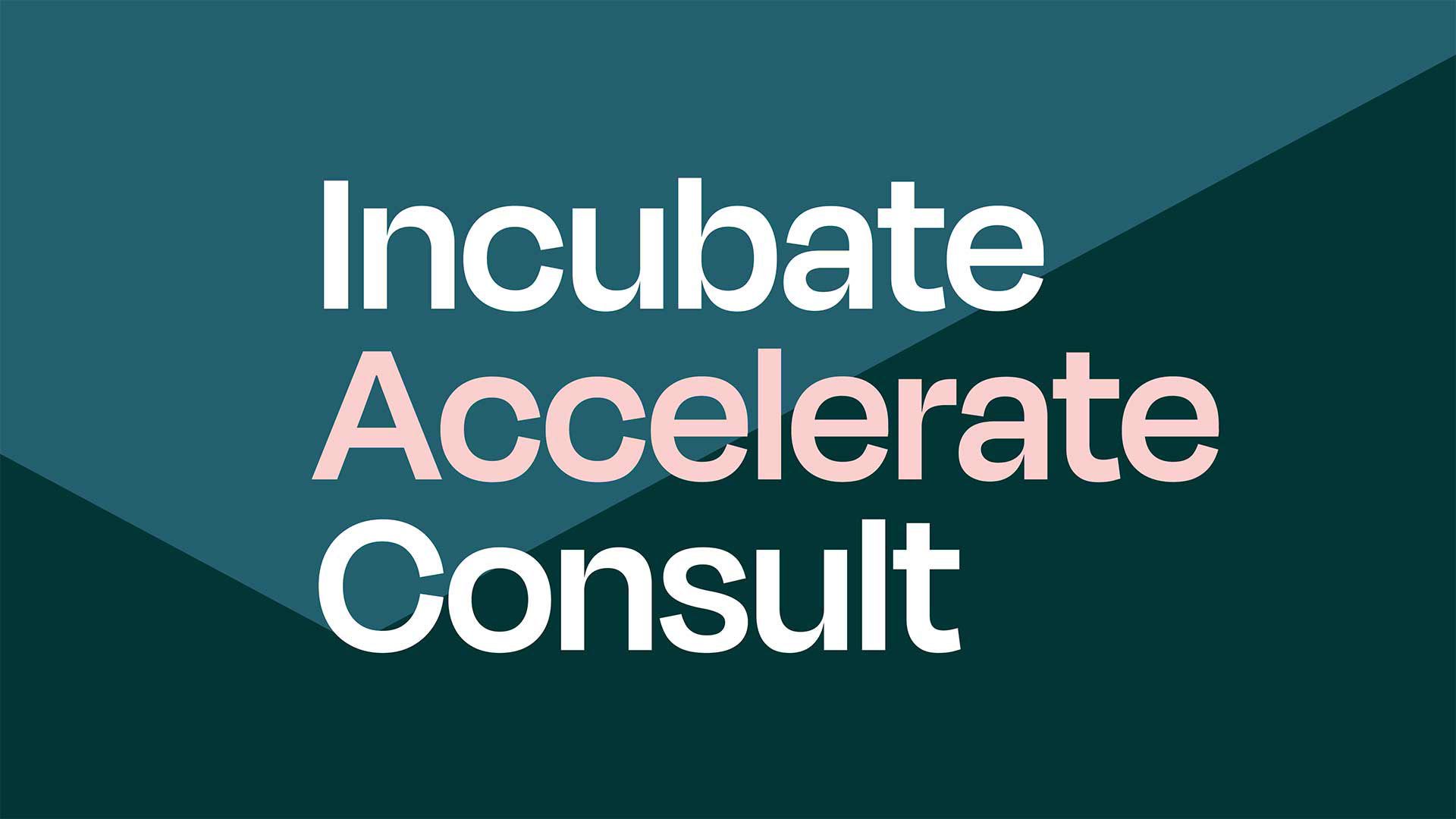
Brand Identity Design
Motion Design
Art Direction
Brand Identity Design
Motion Design
Art Direction
.
.
Background
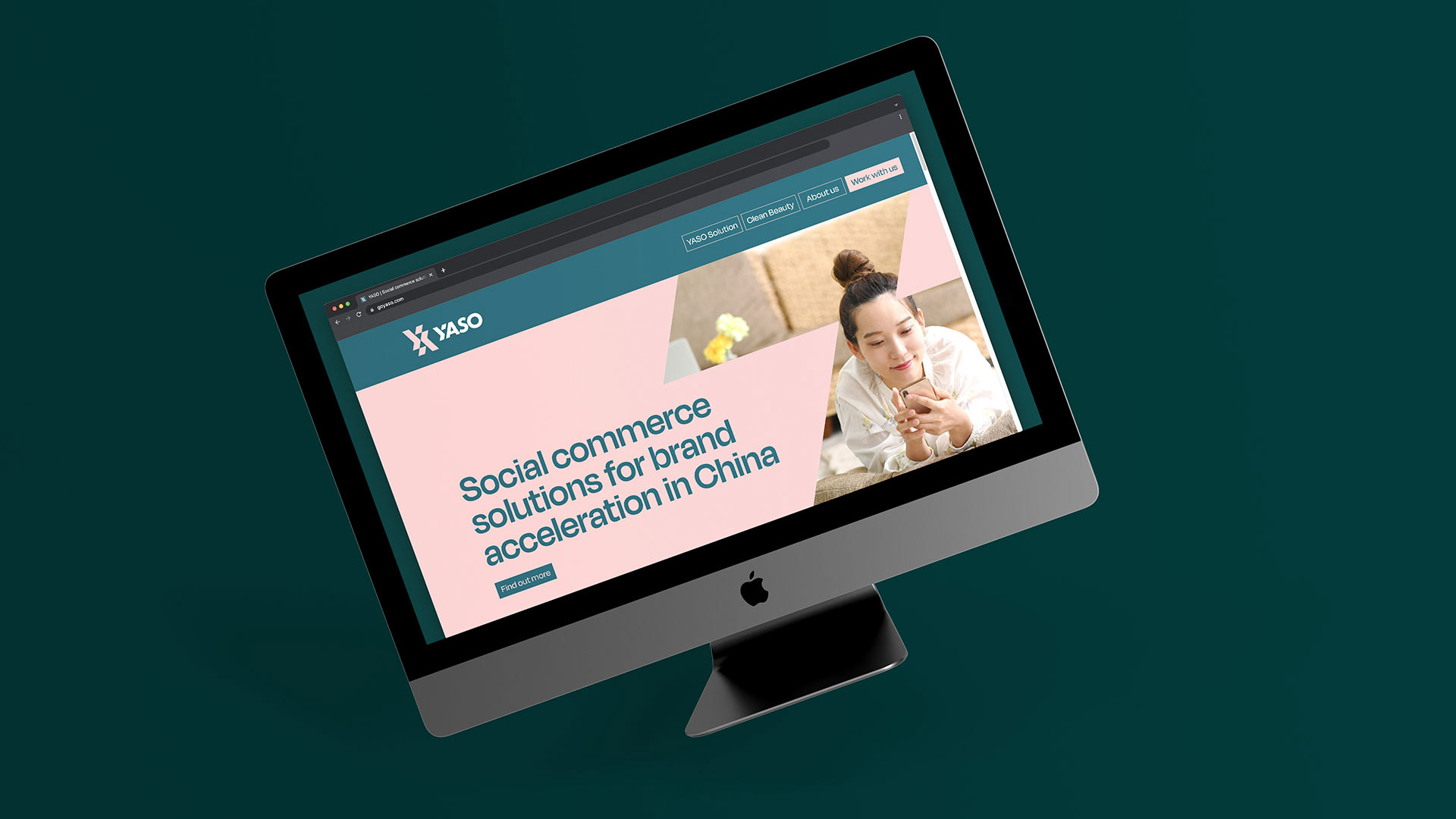
YASO, formerly known as Kuai Commerce, underwent a major transformation as it prepared to go public.
This rebrand wasn't just about a new name and logo; it was a strategic move to better connect with their target audience: high-growth, direct-to-consumer brands.
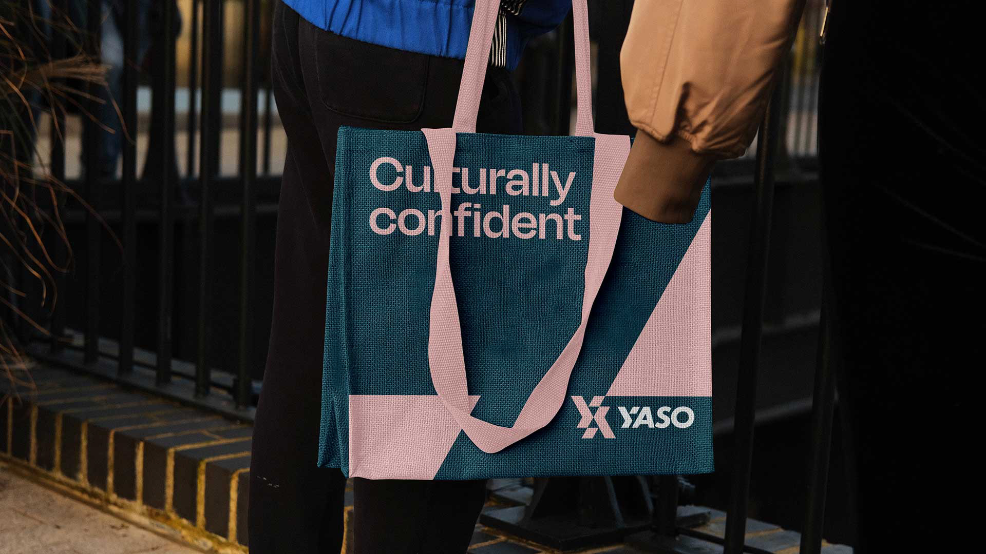
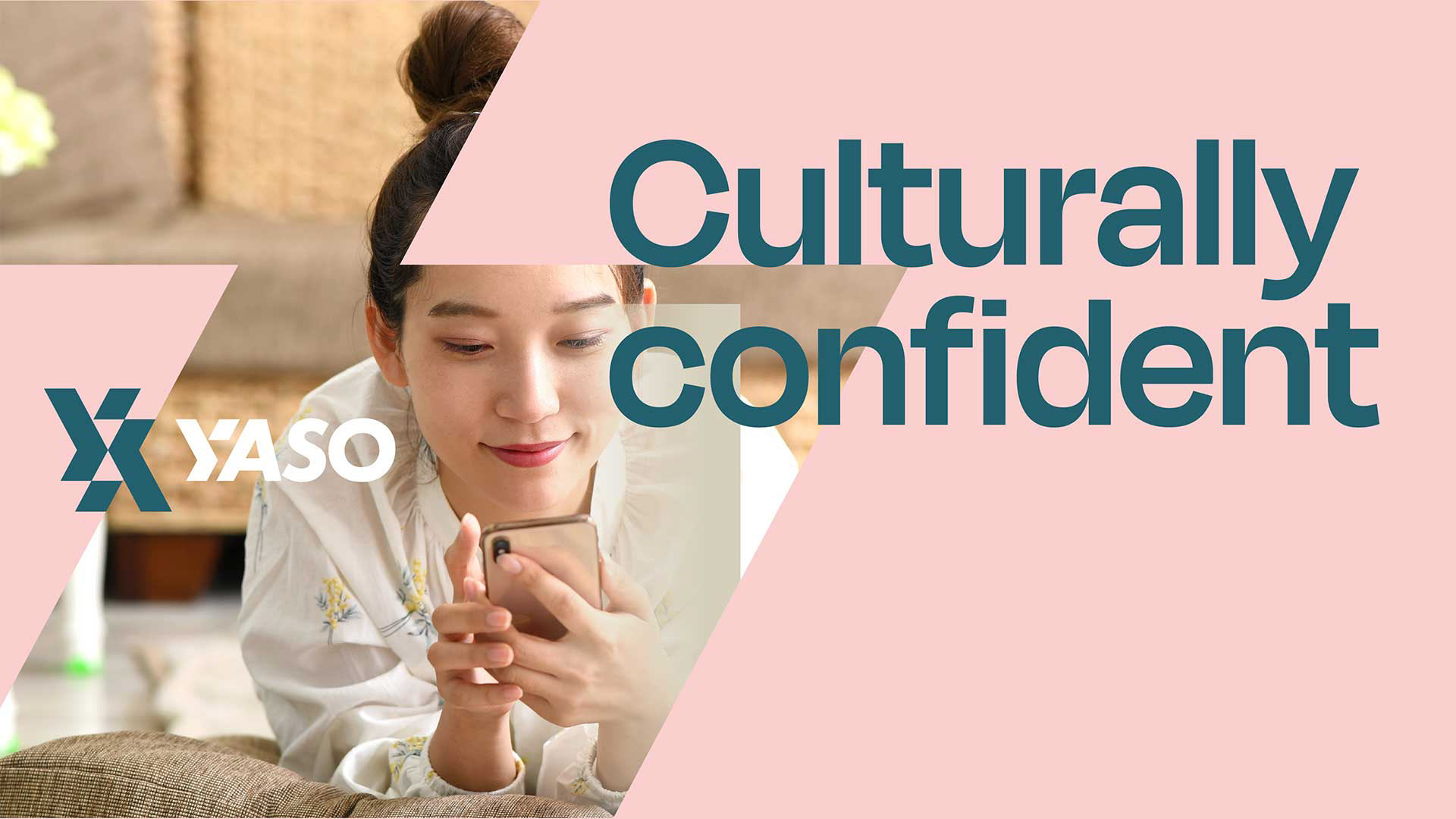
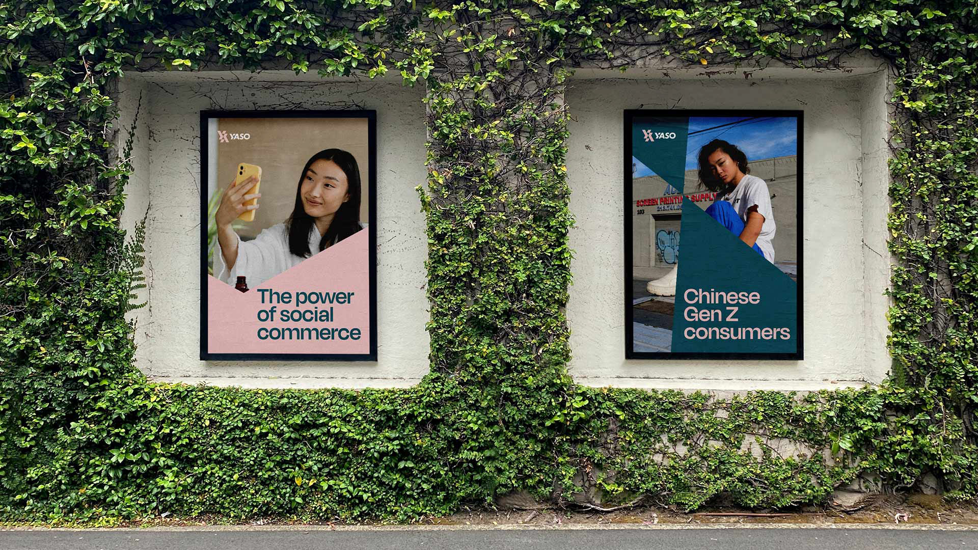
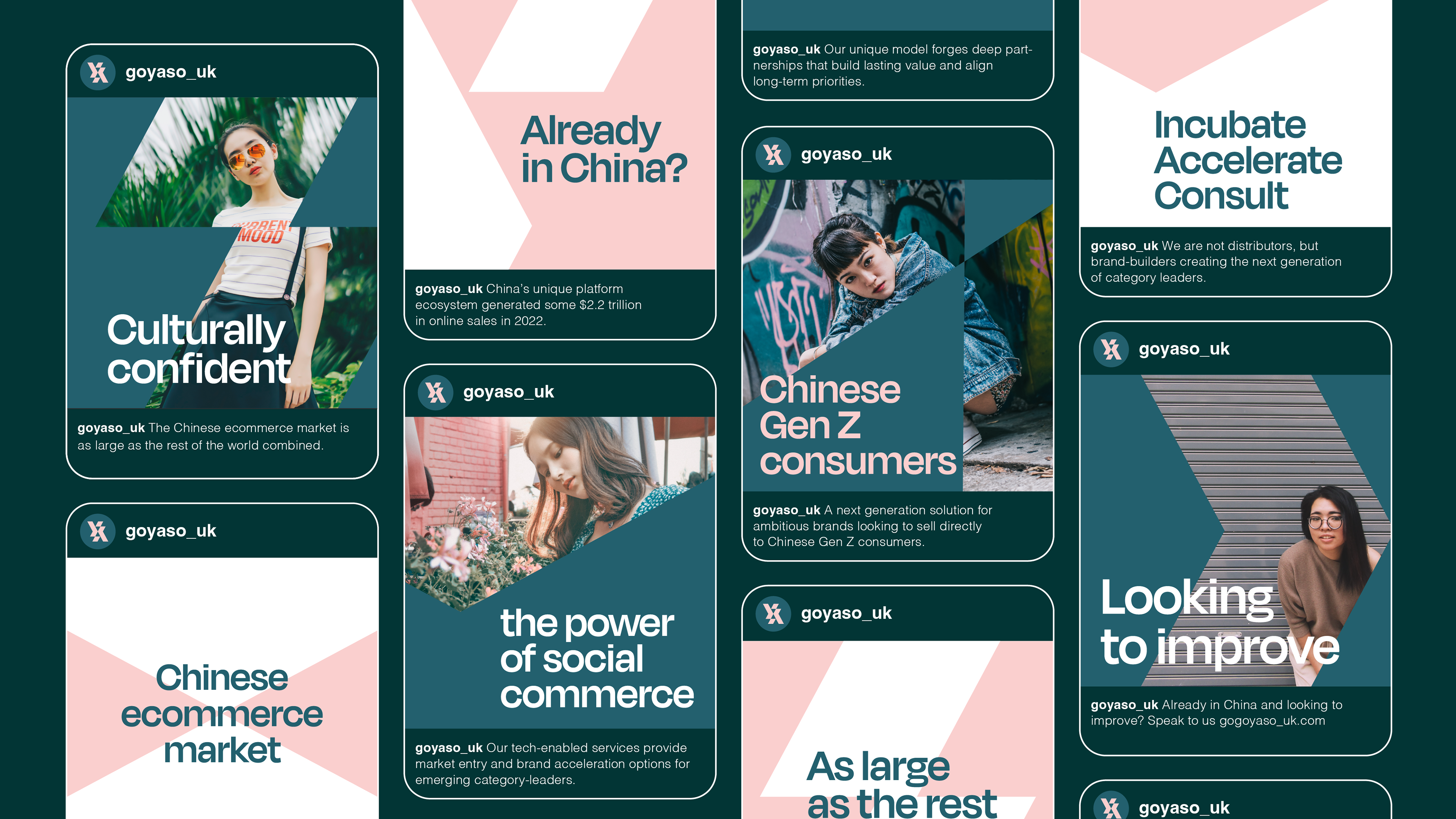
The new brand identity clearly communicates YASO's expertise in social commerce and its ability to help businesses thrive in both China and the UK.
.
Opportunity
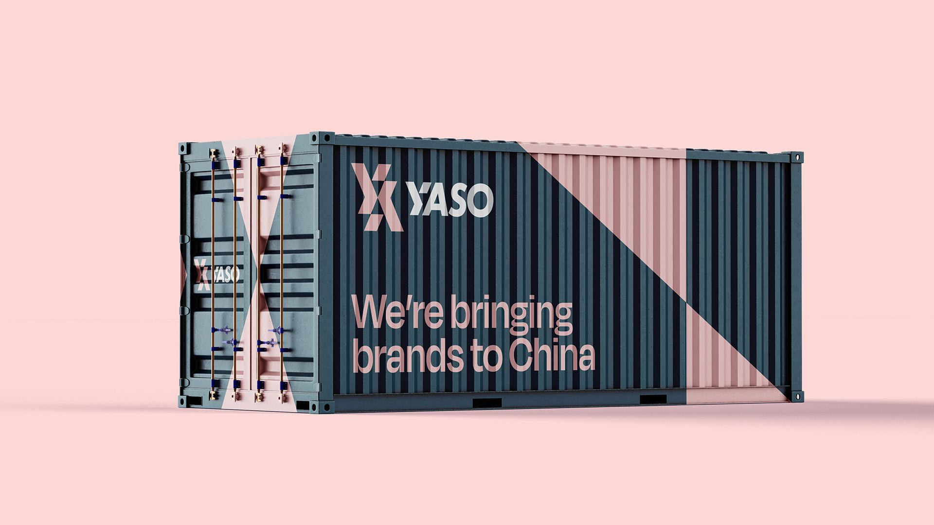
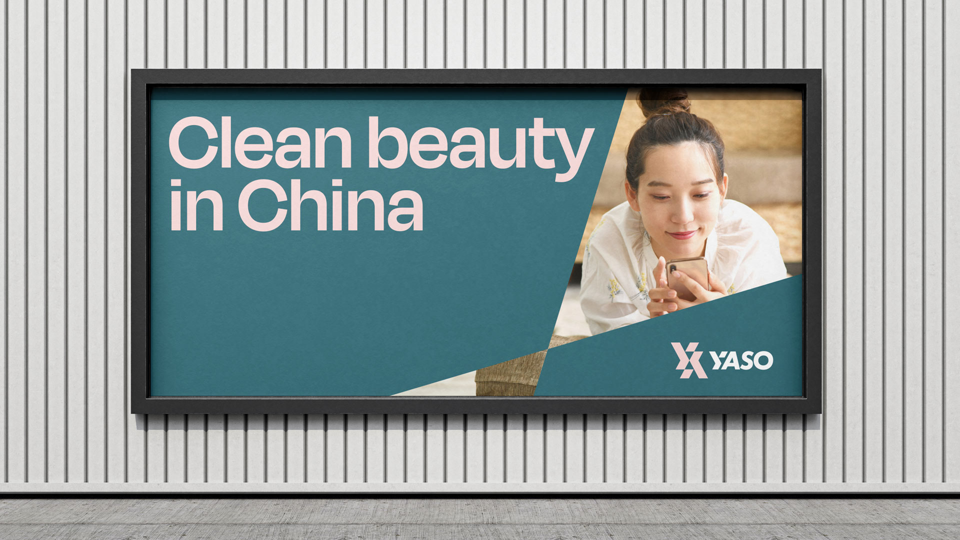
With a fresh new look, YASO can now confidently showcase its comprehensive range of services. They offer everything a brand needs to succeed in China, from strategy and marketing to logistics and customer support.
This is particularly valuable for beauty brands eager to tap into the lucrative Chinese market, especially among Gen Z consumers. YASO acts as a bridge, connecting these brands with key influencers and providing the tools and knowledge to navigate the complexities of this unique market.
.
The solution
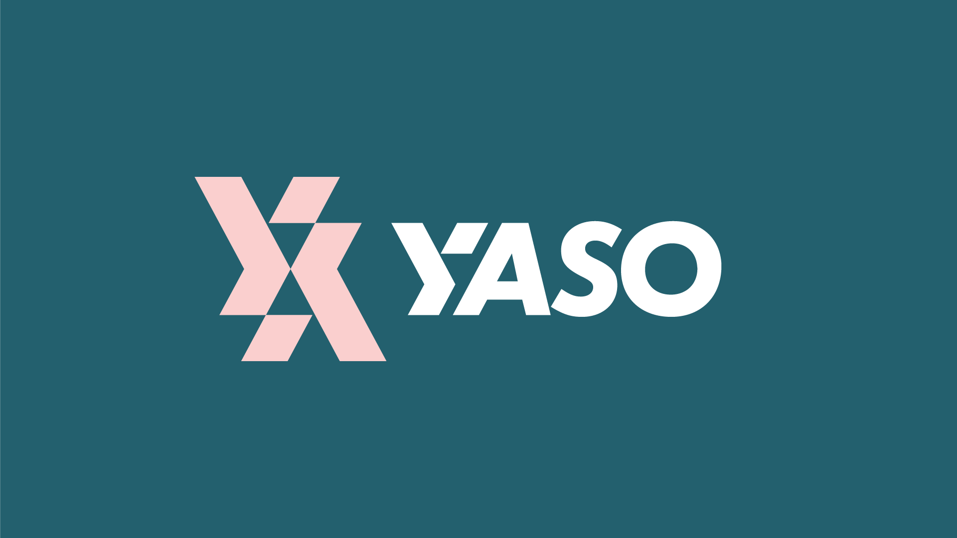
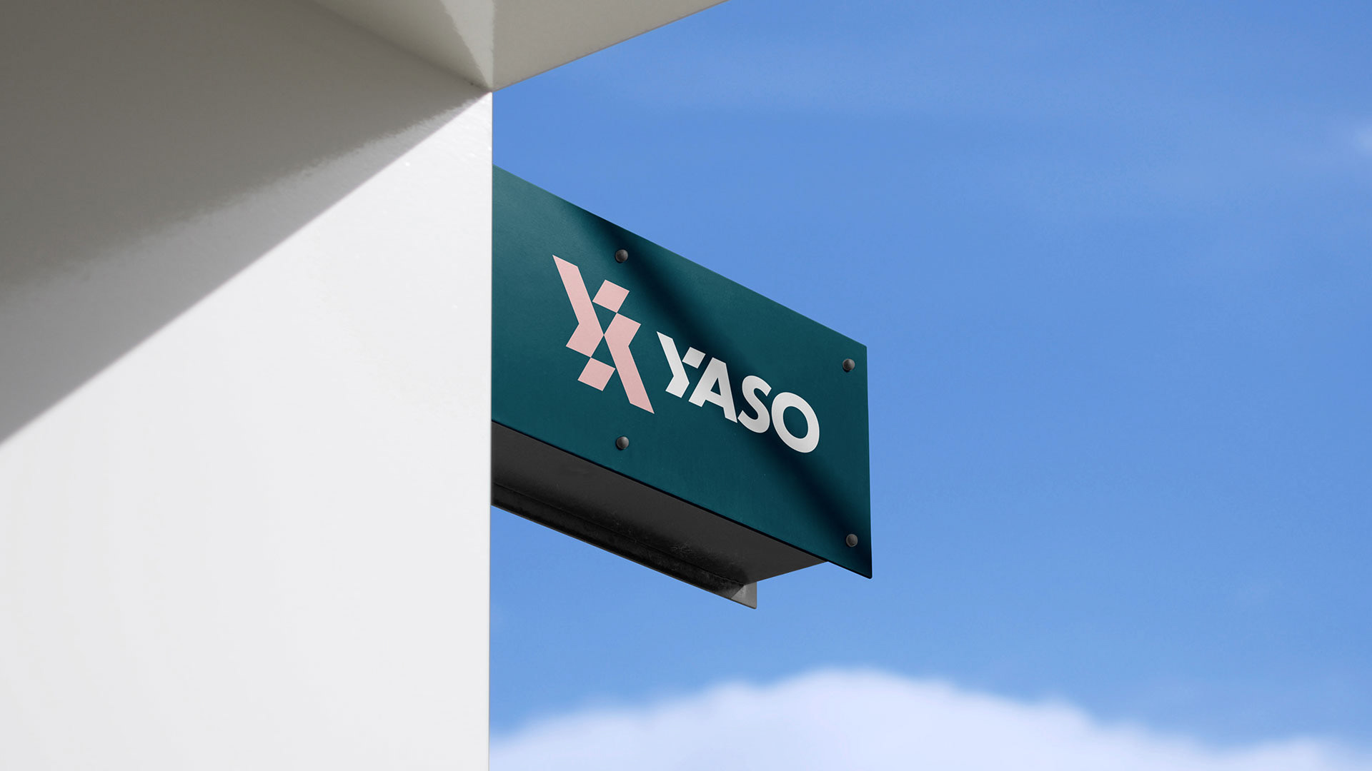
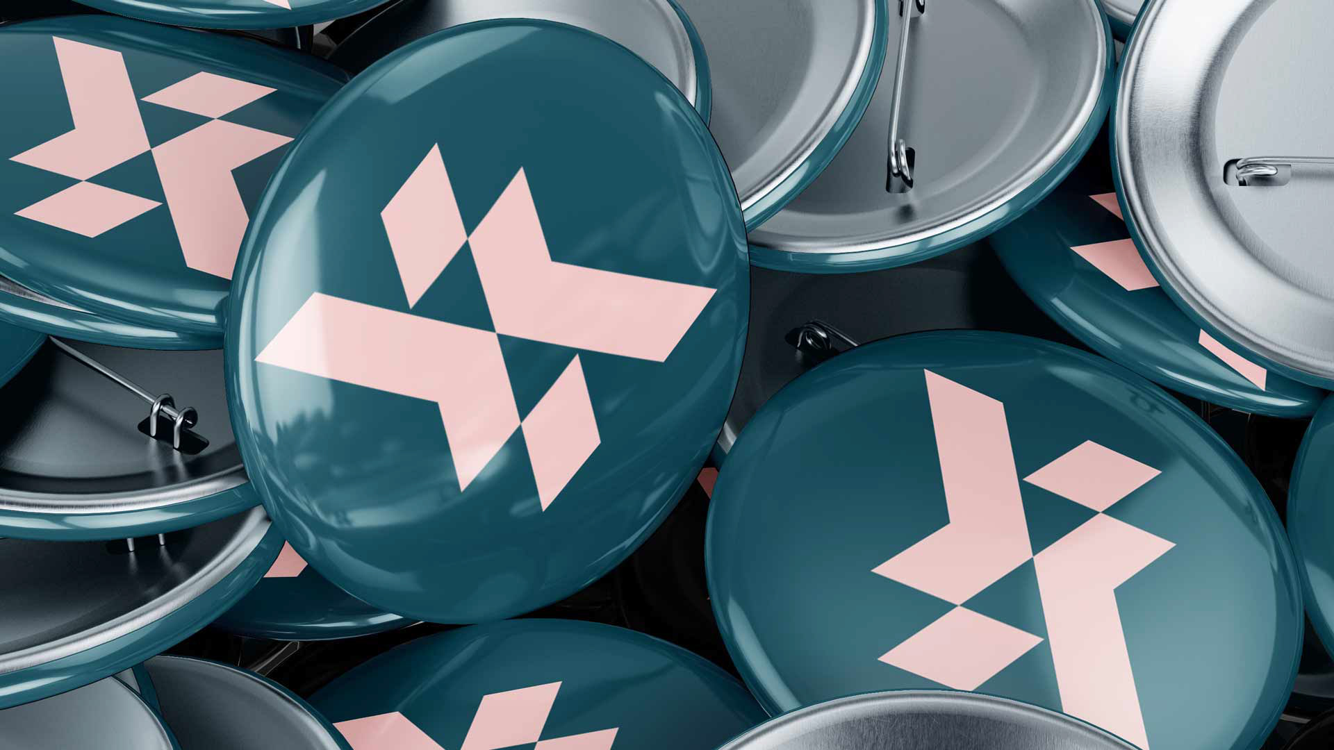
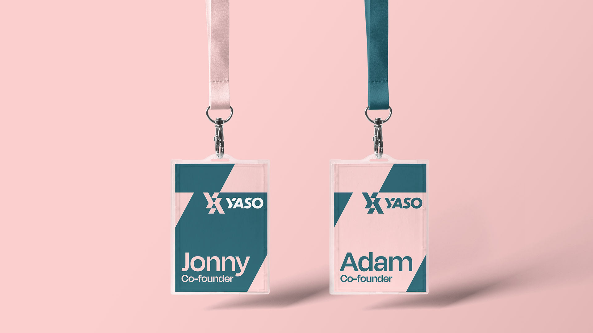
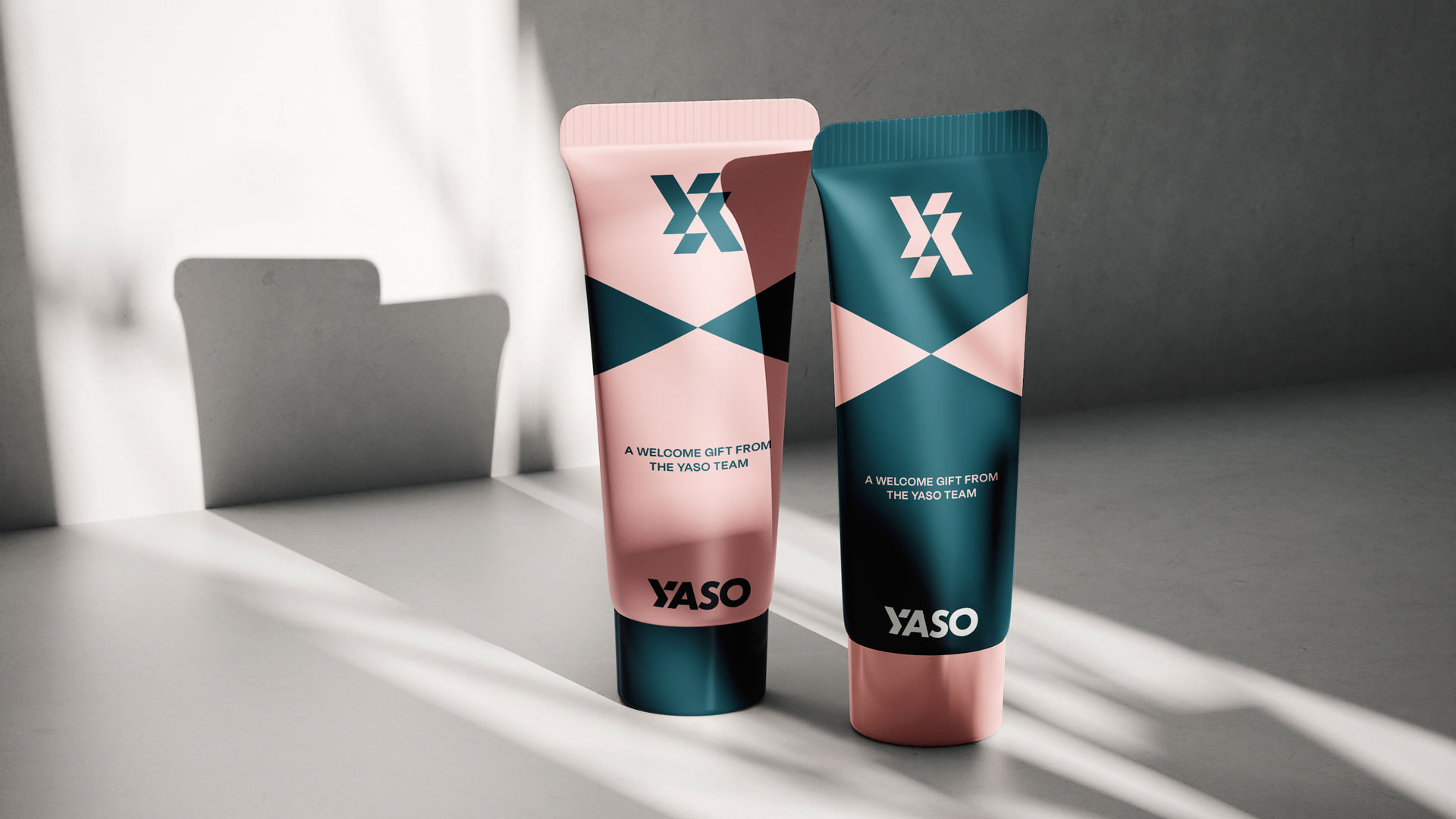
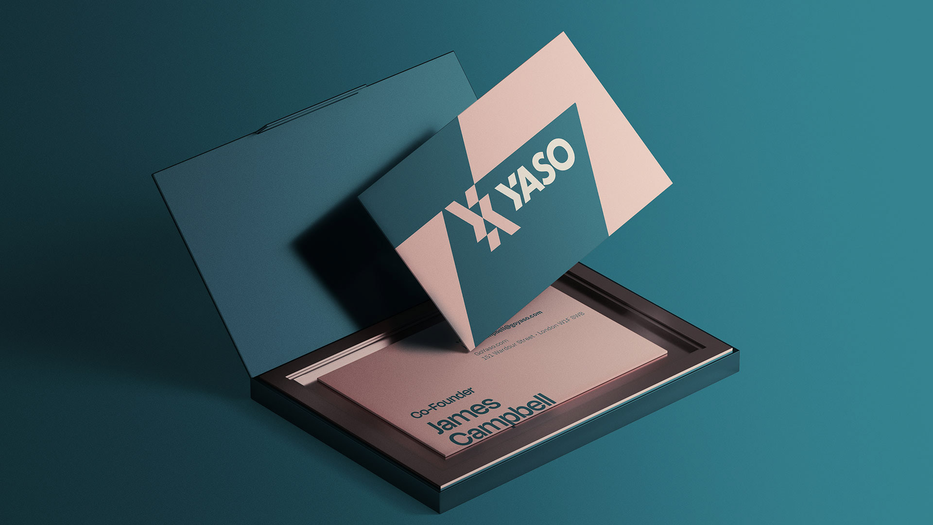
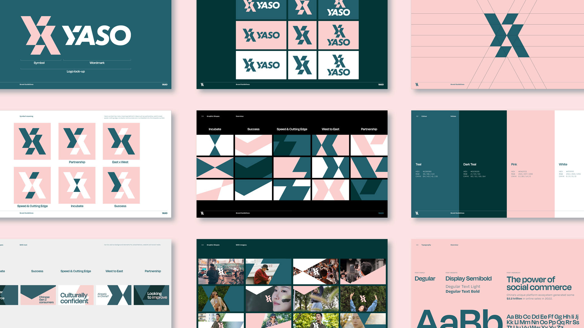
At the heart of YASO's new visual identity is a distinctive "Y" symbol, representing the company's core values: partnership, bridging East and West, innovation, and driving success.
This striking symbol, along with the overall brand design, creates a memorable impression and effectively communicates YASO's commitment to helping its clients achieve their goals.


.
Client
YASO
Brand Design / Motion Design
Andy Lawrence-Levy
Web Development
Niall McDermott
Niall McDermott